Case Study
Contribiia
delivering the MVP for a collaborative money-saving app
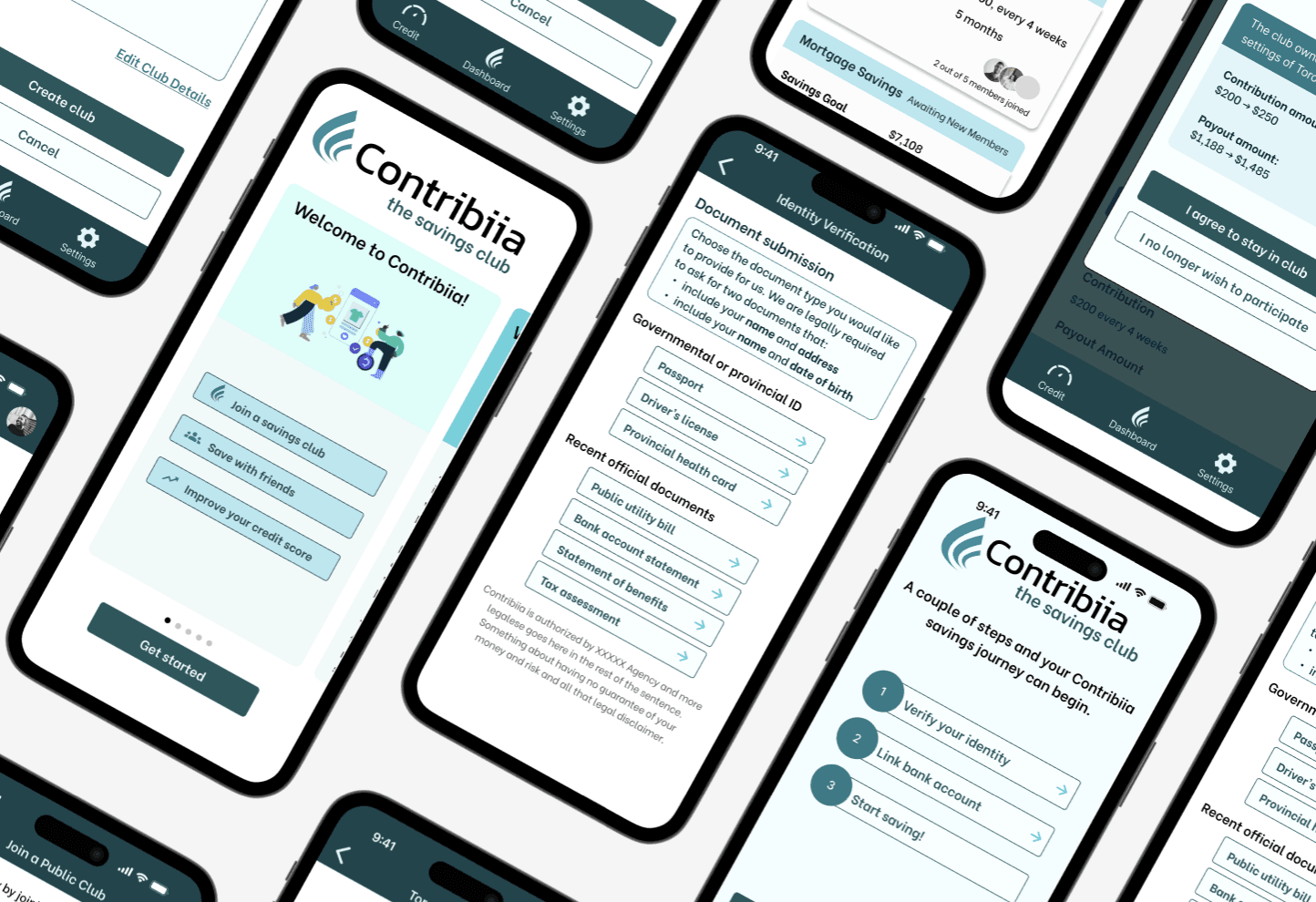
Contribiia information
Headquarters
Ontario, Canada
Industry
Finance
Founded
2024
Challenge and context
The CEO had an idea for a collaborative savings app, based on rotational savings clubs. However, this concept was untested.
My goal was to deliver a MVP to present to potential stakeholders, leading three UX designers.
Results
Delivered MVP of major flows of the app
Greatly increased value proposition of CEO's initial app idea
Created logo, branding and style of Contribiia
Directed UX team to create a cohesive and coordinated app
Problem
Many people face barriers in building savings, whether from personal problems or institutional barriers, which greatly affects their current and future financial stability.
Final Prototype
42%+
Increase in trustworthiness score
19%
Reduction in user click errors
32%+
Increase in usefulness score
Iterations
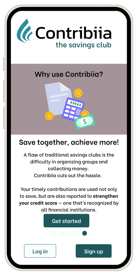
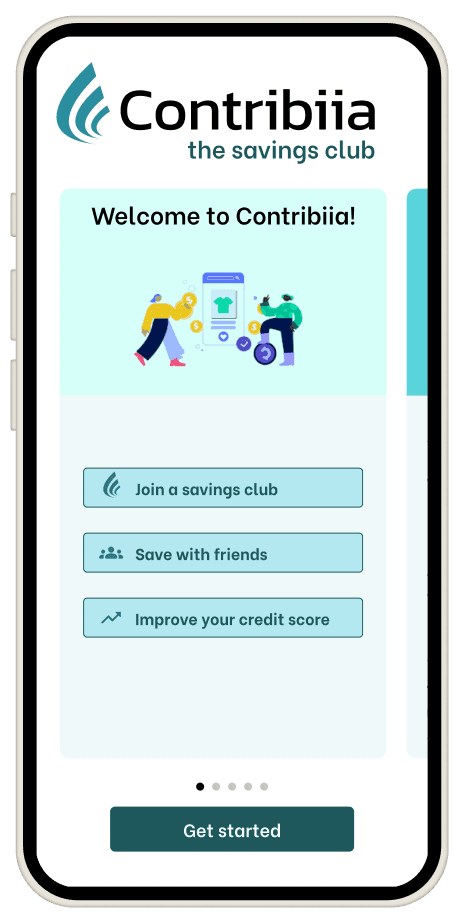
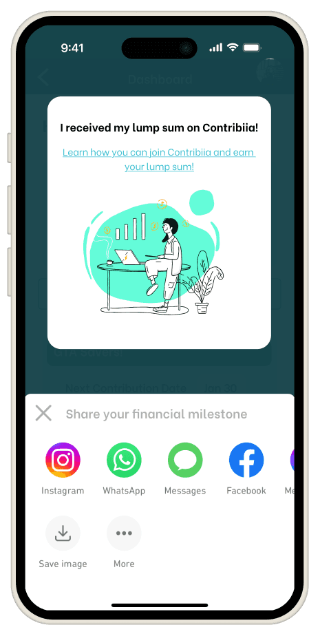
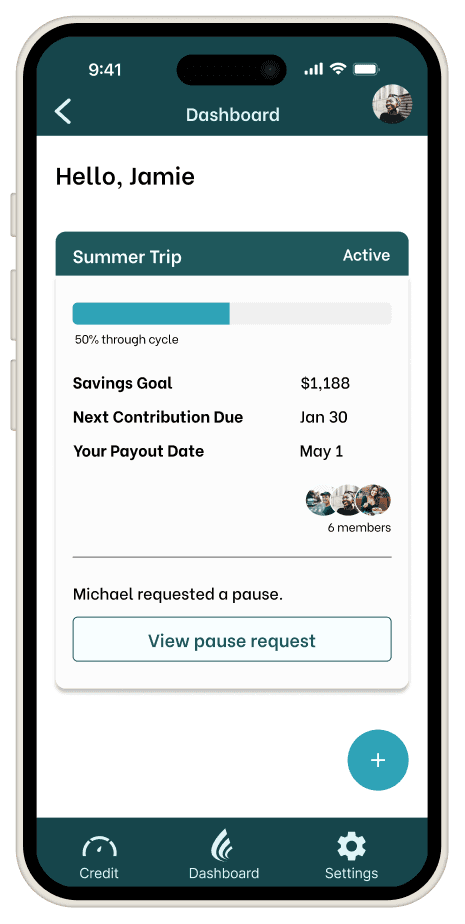
Design library
The designers on the project were working with inconsistent sizing, spacing and styles. I created a consistent design library that can be built upon on as the app expands.
Results
With newly improved value proposition, users better recognized value and appeal of Contribiia
"It's cool that I can see credit insights and that this would help improve my credit score."
"I like the idea of saving money with friends and family, that we can hold each other accountable."
"I like that it's better than just saving money in the bank."
96% user testing success rate of joining and participating in a savings club
Delivered cohesive, unified app and created the logo, branding and style of Contribiia.
Created the logo, branding and style of Contribiia.
Want to find out more about the process of developing Contribiia's MVP?
Got time? Read full case study (10+ minutes)
Background
The CEO, already having done his market research, knew he wanted to bring the idea of rotational savings clubs to Canada, in a modernized app form.
How does a savings club work?


What is a rotational savings club?
Members (usually friends or family) contribute money together on a set schedule and take turns receiving the entire amount.
They are prevalent in areas where traditional banking resources are harder to access.
These are known by several names worldwide, such as ROSCA (rotating savings and credit association), chit fund, esusu, tanda, and pardna.
How does a club work?
Why participate in a club?
Are there any downsides?
Discover: What do we need to find out before we start designing?

Following the double diamond process, the team started with user interviews.
I personally did not know about savings clubs prior to this project. My skepticism led me to wonder how potential users would see the app.
The team's findings were based on our two distinct interview demographics.
Insights from: users unfamiliar with savings clubs
Lack of knowledge of how a savings club works, wariness of this unknown concept
Unsure of advantages of savings club over bank or traditional savings methods
Skeptical of trusting others in savings journey
Insights from: users that have participated in savings clubs
Familiarity with concept makes them more open to trying a digital version
Concern: How is this better than the traditional (offline) method?
Former club organizer can see appeal of using app instead of manually contacting group
Potential benefits
Avoiding the more formal procedures of getting a bank or payday loan
Saving/raising money more quickly than if saving alone
Social accountability of involving friends/family in saving
Forming better financial habits by having set savings plan
Potential concerns from users
Unsure of trusting unknown app with financial information
Unsure of trusting others to pay in on time
What potential hidden downsides could there be
Further research: Customer journey map
We created two user personas, based on our original interviewee groups.


Mapping out the customer journey map for our two different user personas showed us: where their experiences and pain points would differ, and what opportunities there were for Contribiia to capitalize on.

In our various research methods, we saw the potential for how we could address user concerns about trust and safety, while providing a way for them to save and better their financial standing. Next, the team moved on to figuring out what we would build.
Define: What do we need for a functional app?
With our findings in hand, we could properly set our goals.
Problem statement
Many people face barriers in building savings, whether from personal problems such as motivation and lack of knowledge on saving strategies, or institutional barriers such as a low credit score or lack of credit history.
This affects their current and future financial stability as well as their ability to make large purchases and investments.
Narrowing the scope for an MVP
The team tossed many ideas around for what would make a great app.
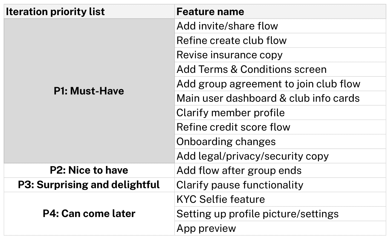
From there, we ranked our potential features in order to prioritize the most important.
Creating wireflows
We ideated for the key screens, such as the page that would show the group status and progress.

From there, we laid out the sitemap and decided which user flows we wanted to build out, keeping in mind our user personas.
We also needed to comply with Canadian security and legal requirements for ID verification.


User testing insights
After our initial wireflows were created, we tested them with users.
Clarity of terms
We had not finalized our terminology at this point, so many users were confused about "contribution cycles," "public groups" and "payouts."
Public groups
When users found out they had the option to join groups with strangers, there was an almost unanimous sentiment of extreme discomfort. Users also wanted more control and clarity around the group settings, such as fees, contributions, and progress.
Security concerns
Several users voiced concerns about the safety of uploading personal documents and linking bank accounts. Clearer explanations about data encryption, privacy, and the security measures needed to alleviate concerns.
Dealbreaker: value of this app over others
The biggest concern was the failure to communicate the value proposition of the app. Several users questioned why they would want to use this over traditional savings methods or a non-app version of a savings club, which we did not have a real answer to.
Concern:
I realized the client's vision for the app was flawed.
The value proposition over a regular savings account was in question.
There was no user selling point for Contribiia.
Users unfamiliar with savings clubs were already hesitant about the concept.
Users did not have enough reason to trust this app, and other people, with their money.
Back to the drawing board
We needed Contriibia to have a stronger value proposition.
In its current state, it wasn't much better than just putting money into a bank.
Updated value proposition:
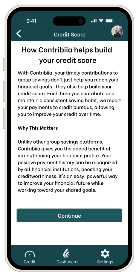
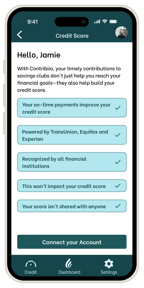
Contribiia is not just an app to save money, but helps users build their financial literacy and future.
Not only can users save money collaboratively, but they can work on building and monitoring their credit, learn about savings strategies and create a more secure financial future.
With a stronger value proposition, we could proceed with a clearer vision of what the app would be.
The UX design team added new wireflows for the credit building and monitoring features.
New credit score features
Users can sign up for an optional credit score monitoring system.

App branding and style
As we iterated, we also turned our attention to how Contribiia should feel. The team ideated with a several starting concepts, and refined them based on the client's feedback.
Color ideation

Logo design

Style tile
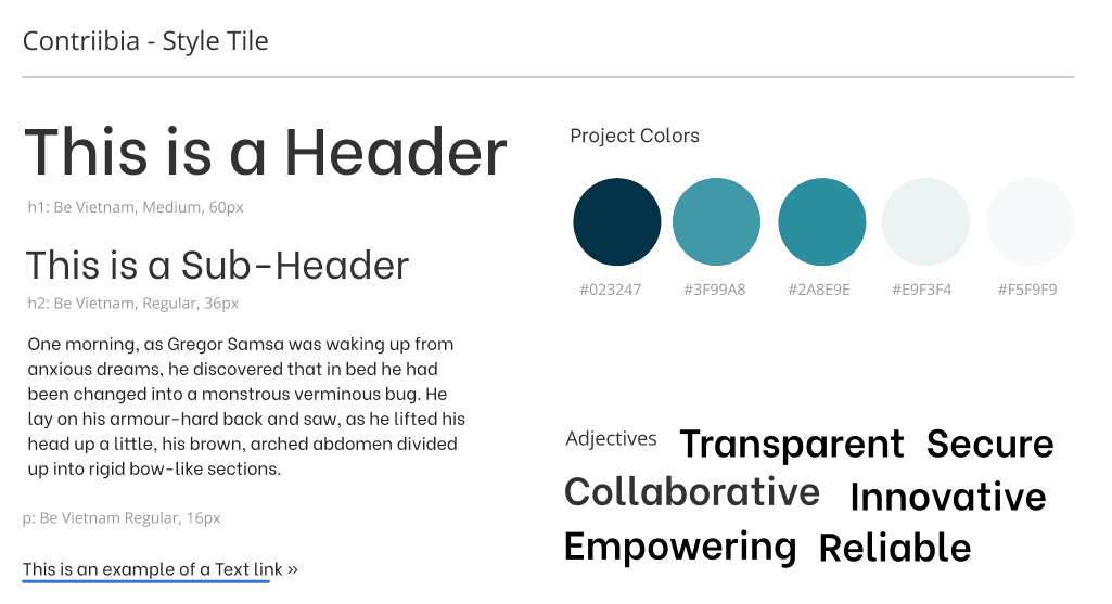
With the branding of Contribiia decided, it was almost time for the team to incorporate the user testing feedback to move up to high-fidelity wireframes. However, there was one more matter to take care of first.
Design library: ensuring a consistent appearance
One issue early on in our wireflow building was that there were three different UX designers working on the file, each with their own style.
At first, the inconsistencies of the low-fidelity wireframes were less of an issue because we were merely sketching out ideas.
Individually, each screen looked fine, but when looking at the app as a whole, it was jarring. As we moved into higher fidelities, this became more and more of a problem.
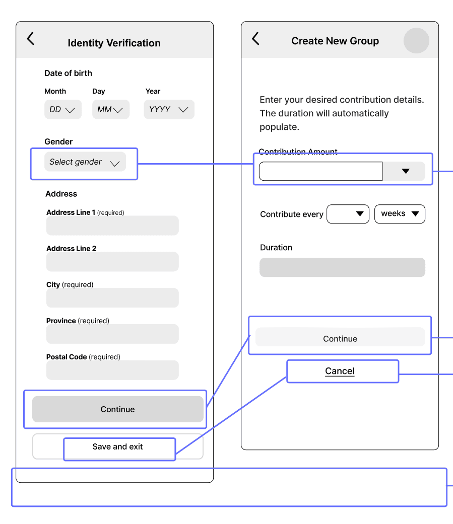
Design library: creating the specifications
As everyone was previously going off of "what felt right" to their individual sensibilities, there was no real consistency.
I created a library of commonly-used components so there would be no need to create slightly different ones from scratch. I also set specifications for our spacing, padding, and other numbers.


With this library of components at the ready, we were able to create a set of high-fidelity wireframes with a much higher level of cohesion.
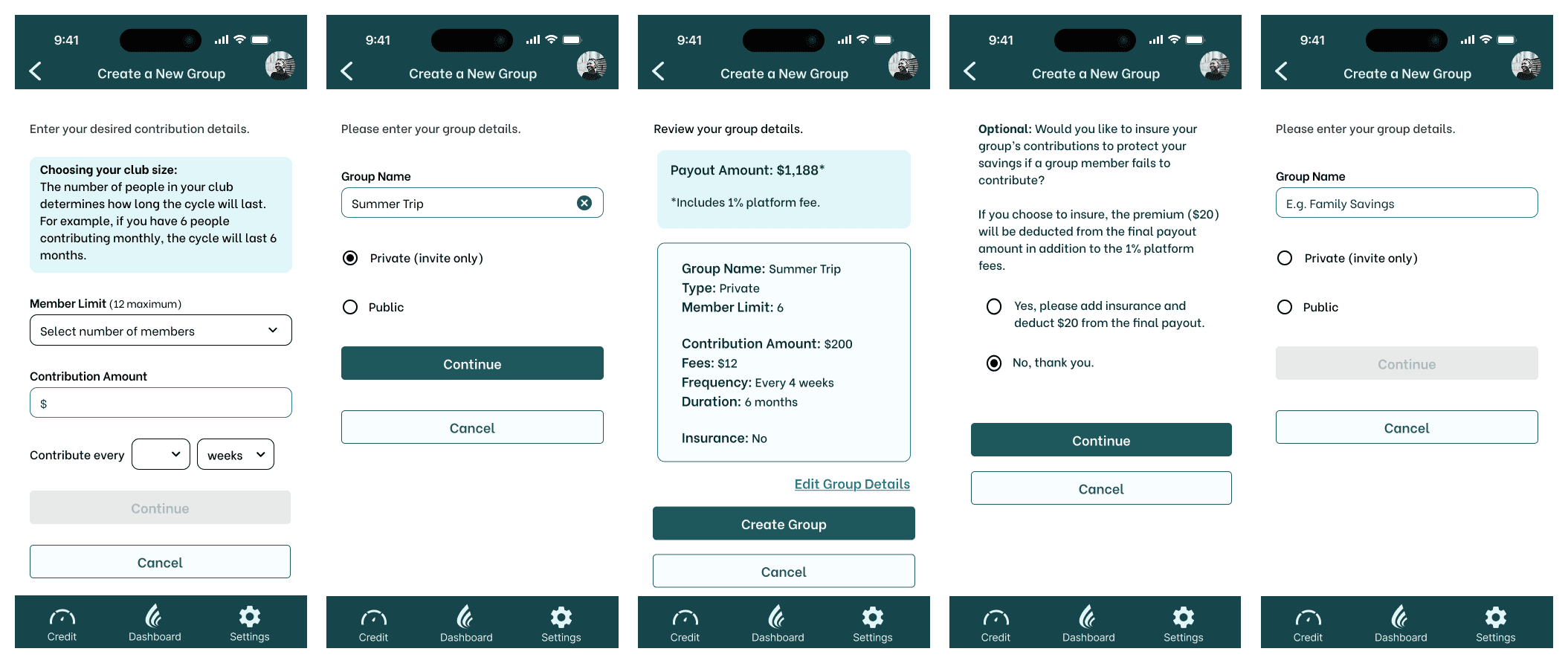

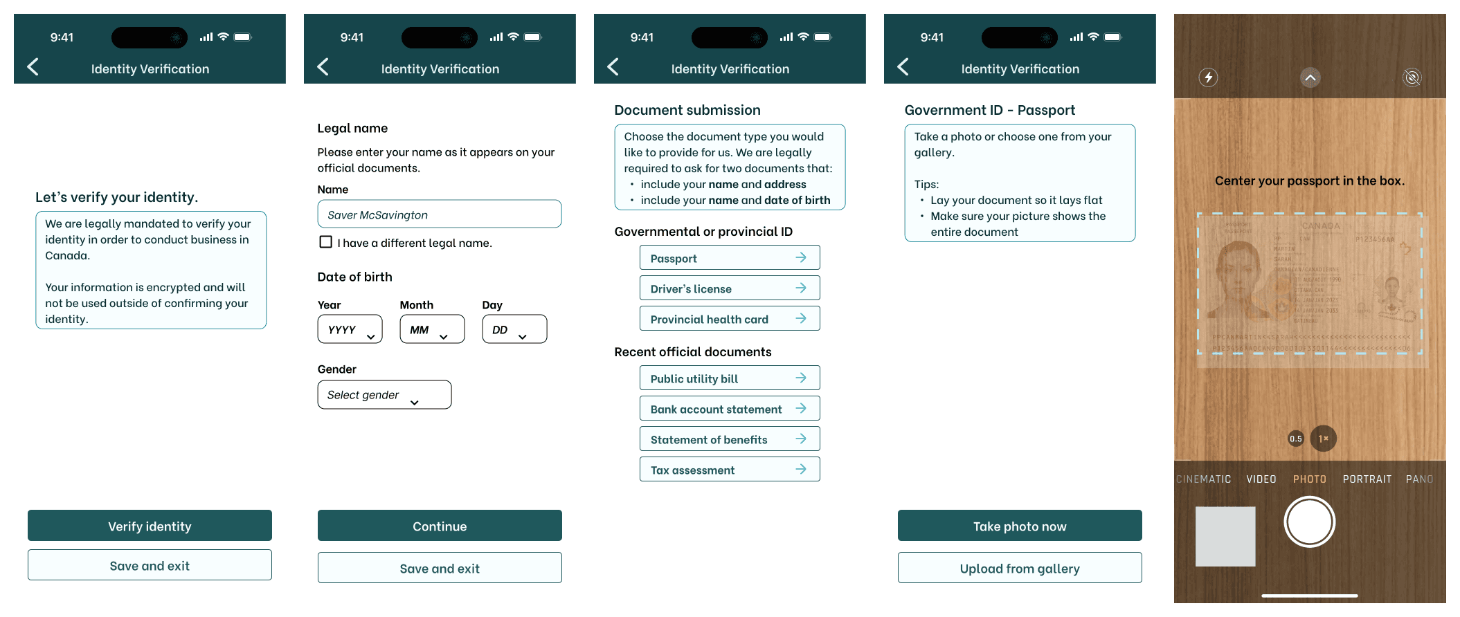
Develop: How can we deliver the minimum viable product?
Usability testing
With the high-fidelity wireframes completed, and time running short, we moved on to testing their usability.
Users were given the prototype and asked to complete a series of tasks.
98% task success rate
6 users were asked to complete 8 tasks
Tasks included onboarding, creating and joining a club, and trying the credit score feature
Areas for improvement
During onboarding, users were still unsure about concept of app
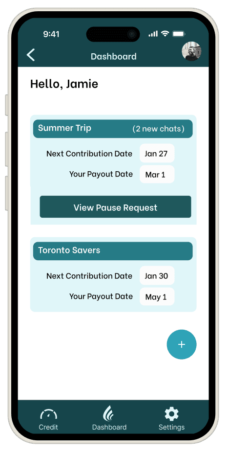
Users found dashboard lacking in features and engagement
Users unanimously disliked "share payout" feature
Fee disclosure came too late and felt deceptive
Our deadline was coming up, so we chose which changes we should prioritize.

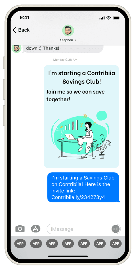
Iterations
Working from our priority list, the team made the most pressing changes.


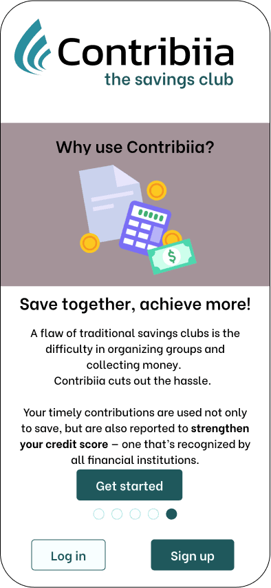

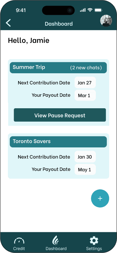
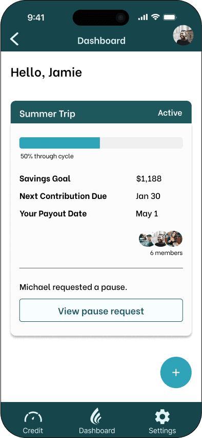

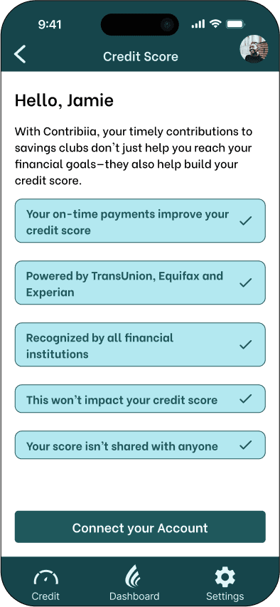
We made the changes and presented the final prototype to the client. These included key flows such as signing up for a savings club, maintaining the club, participation, and using the credit score feature.
See full prototype
Deliver: Next steps for Contribiia
Conclusion and upcoming moves
As the lead UX designer, I was able to bring the team together in making a cohesive product that addressed user needs and goals, especially when we had to reconsider the value proposition of the app.
User impressions
Users completed 96% of the tasks of joining and participating in a savings club
Users recognized the value proposition of collaboration to better their savings and credit-building habits
"It's cool that I can see credit insights and that this would help improve my credit score."
"I like the idea of saving money with friends and family, that we can hold each other accountable."
"I like that it's better than just saving money in the bank."
Next steps
Expand on user profile and other features to build user trust
Integrate affiliate links and partnerships that fit user needs
Return home