Case Study
Thingiverse
implementing a rewards program on a 3D printing sharing website
Role
UX/UI designer, UX researcher
Tools
Figma, Maze, FigJam, Mural
Duration
75 hours, August to September 2024
Goal
Incentivizing and increasing user engagement on a website where users share, download and remix 3D printing files by implementing a rewards program
Results
Balanced user and business goals to add a new feature
Integrated rewards missions and shop features with existing branding and style
88% of users testing were able to navigate through missions and shop
Background
Over the last two decades, 3D printing has become popular as consumer models continue to become more affordable and easier to use.
With this explosion of popularity, platforms have emerged for people to share their knowledge and ideas. Thingiverse is one of these websites.
This is a conceptual case study that is unaffiliated with Thingiverse or Ultimaker.
I followed the Nielsen Norman Group's design thinking phases for this project.

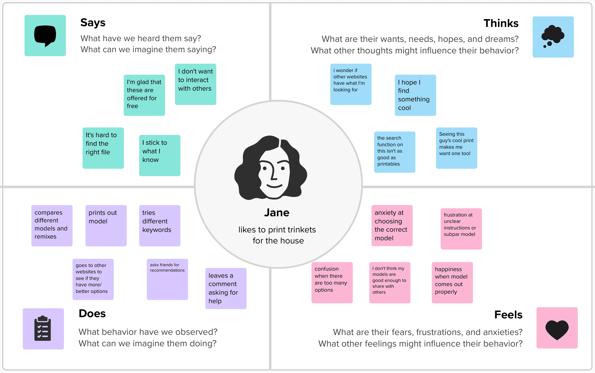
Empathize: How is Thingiverse doing?
On Thingiverse, users design and share 3D models, whether for utility (kitchen parts, shelves, brackets and other household items) or for fun (toys, figures, cosplay).
Thingiverse has a very strong open-source culture.
For example, the site has a "remix" feature that encourages users to tweak the original models for specific use cases (for example, making a more compact version of a 3D printed whistle).
In more recent years, the perception of Thingiverse has gotten more negative, as users took issue with the poor servers and lack of updates to the site.
General user sentiment on how Thingiverse has declined in quality
"Thingiverse is the Myspace of 3D printing. it was first, but it won't last."
"Search function barely works. You search for a dog and the first page or two are literally just what's currently trending."
“Thingiverse is a sad place these days. A relic from the time where MakerBot was an integral part of the maker community.”
"Yes, but I remember a time when it was basically the YouTube of 3D models. It was the one central place to go. Now, there is no other central platform."
However, despite the perceived decline in quality of Thingiverse, it is still the most popular 3D repository site. From a competitor's blog post:
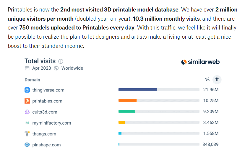
Source: Prusa (Printables) blog post
Since I had gathered the general sentiment around Thingiverse, I wanted to dive deeper by talking to users of the site.
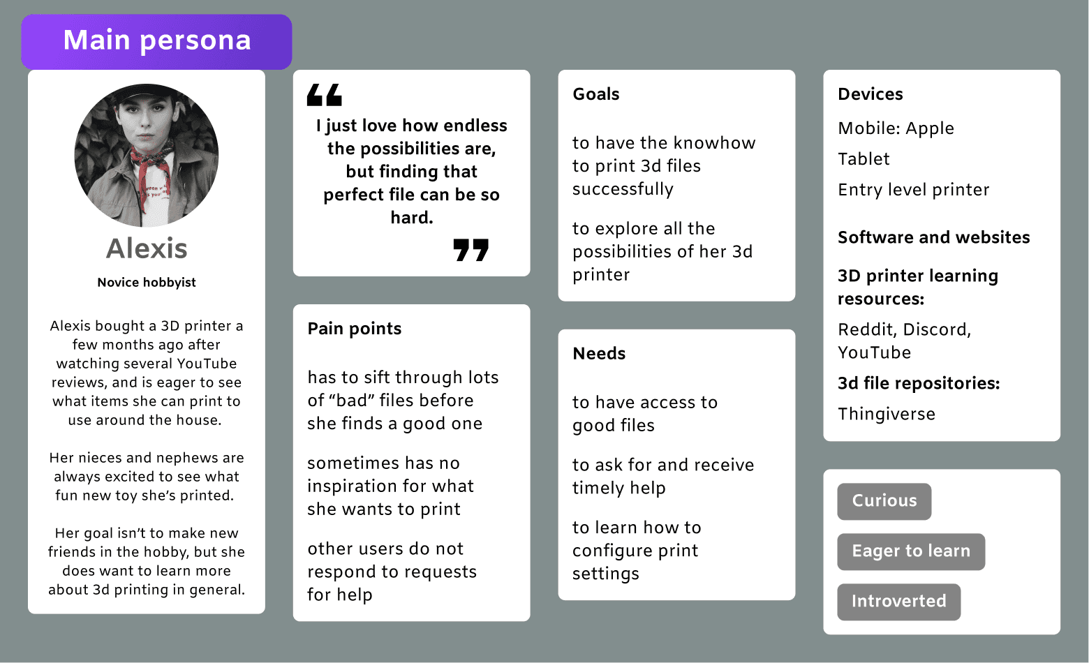
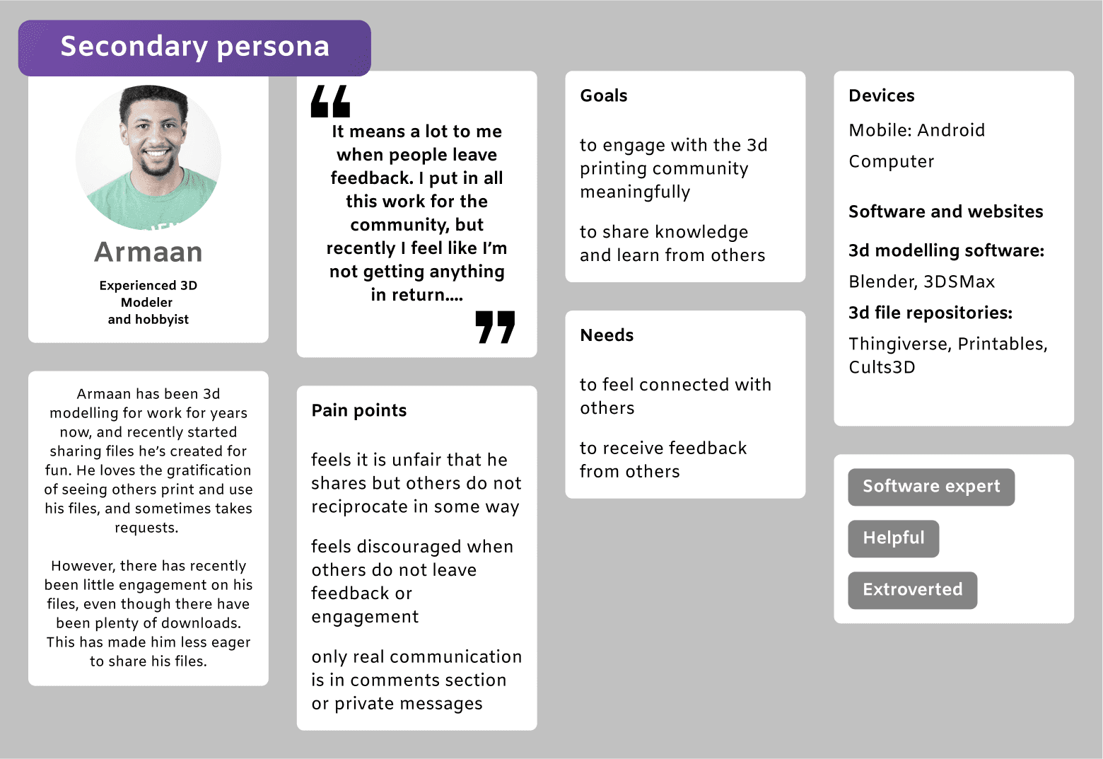
User interview insights
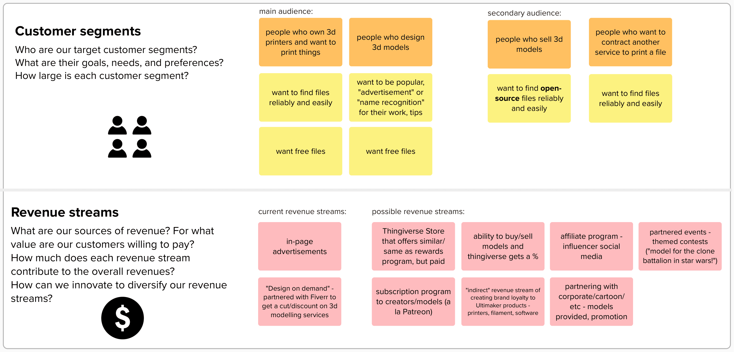
All seven participants knew about the existence of Thingiverse. Users are drawn to the fact that there the site is free to use and participate in.
Users do not want to socialize for “leisure” - if there is communication, it is utilitarian, such as comments on the file to ask for help or clarification
While a marketplace, subscription, or other paid features are not out of the question, they are detrimental to Thingiverse’s reputation as a “free” site
There was a unanimous no from all seven interviewees that they would not enjoy a forum or discussion space.
Users that download files have no incentive to participate in the community.
Users that upload files enjoy receiving feedback and seeing pictures of their creations.
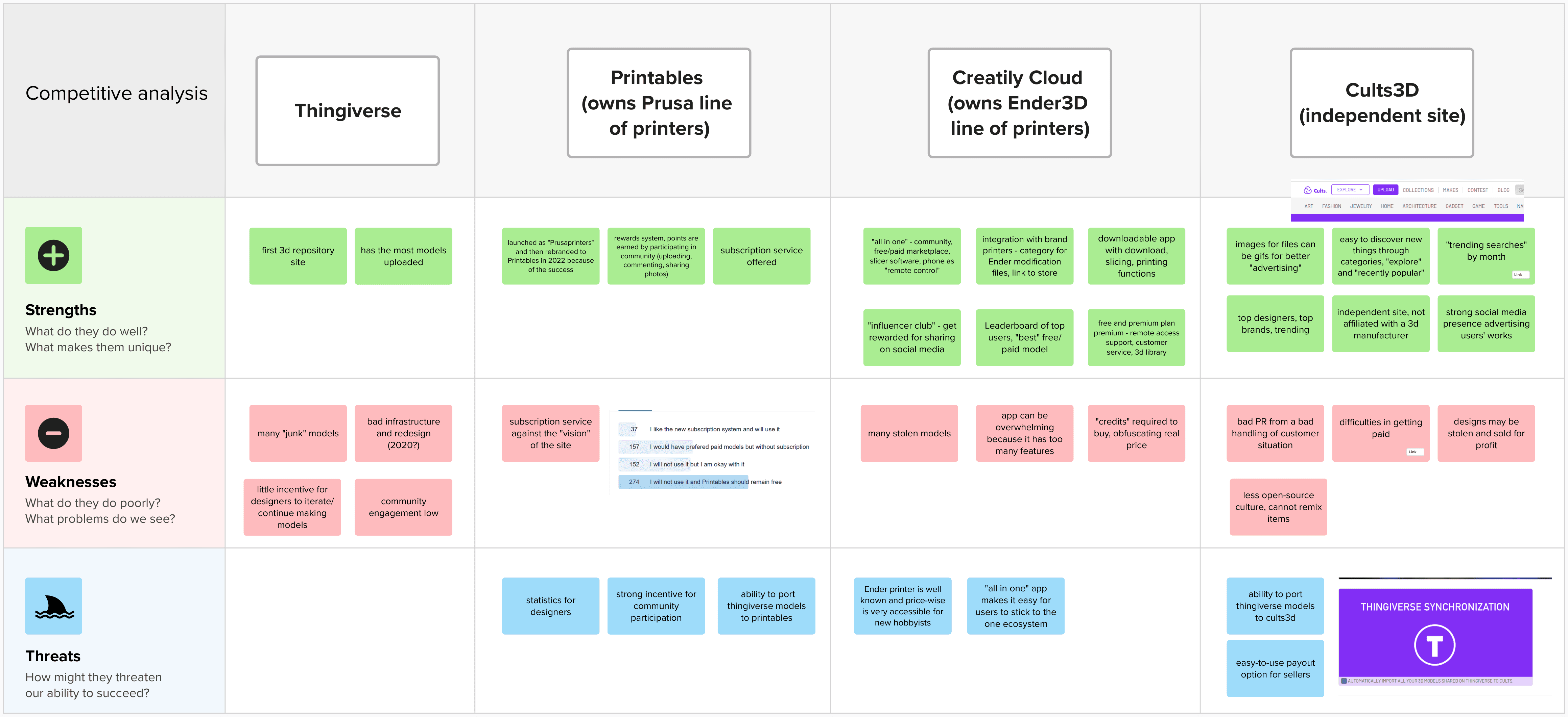
Competitive analysis insights
Other sites have more curation in comparison to Thingiverse. One common complaint about Thingiverse is the lack of quality control - anyone can upload any model.
On other sites, there is a marketplace for users can buy and sell files. These files are generally perceived to be higher quality than free ones.
Monetization: other sites offer printing services, so users can receive a printed version of a model, with many different options available (colors, sizes, print material).
Some sites specialize in a niche; for example, being known for tabletop miniature models.
As shown by the user interviews and research conducted, what would be good for business goals was not necessarily the same as what the user cared about. I had to figure out where the fine line to walk would be.
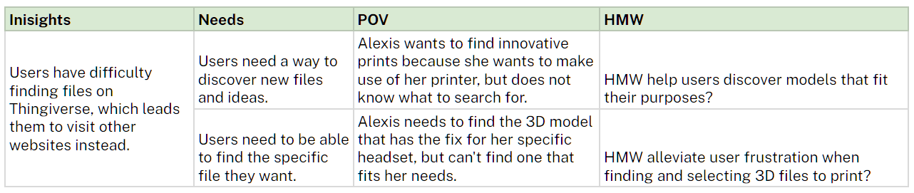
Define: where are users' problems?
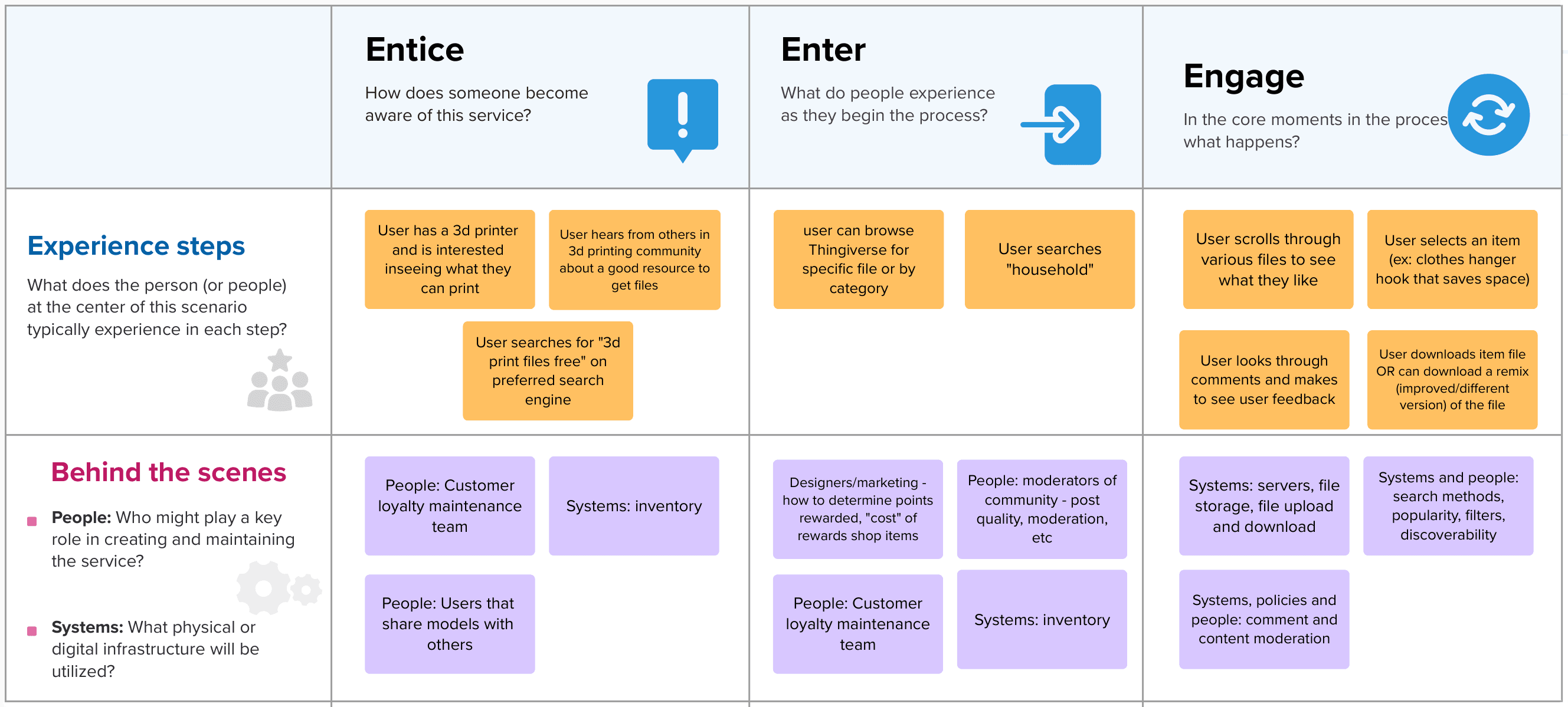
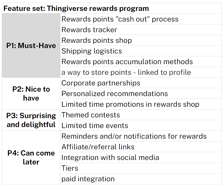
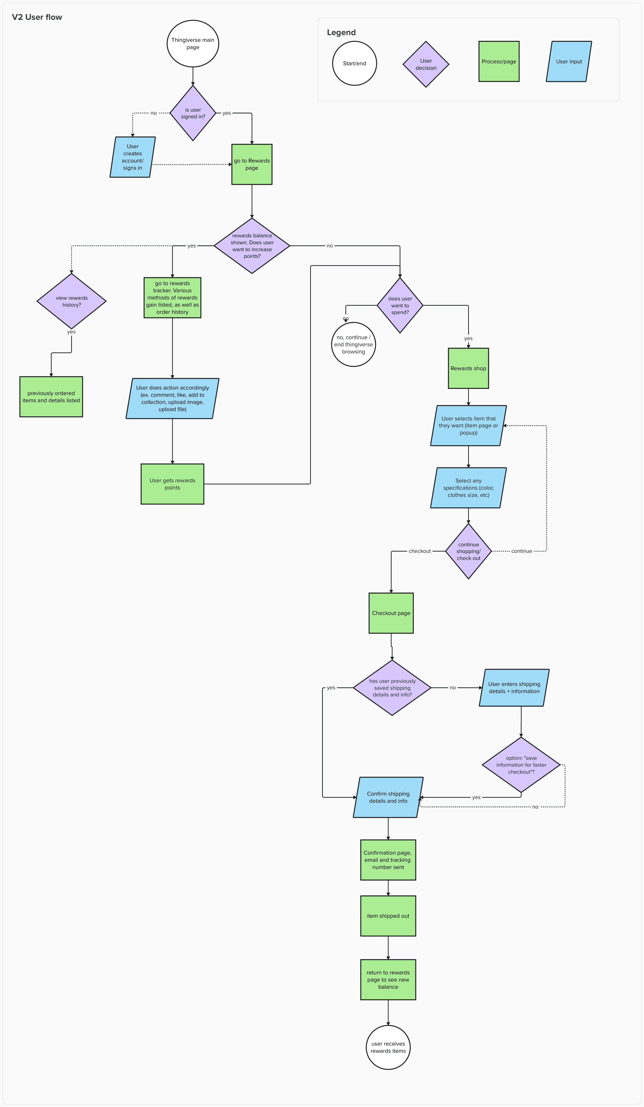
Prototype: building out the rewards shop
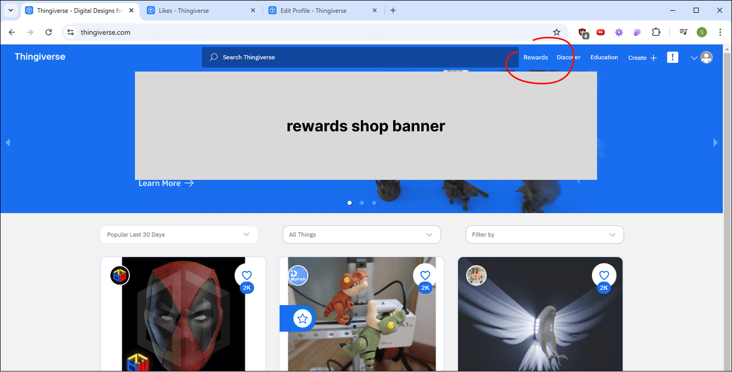
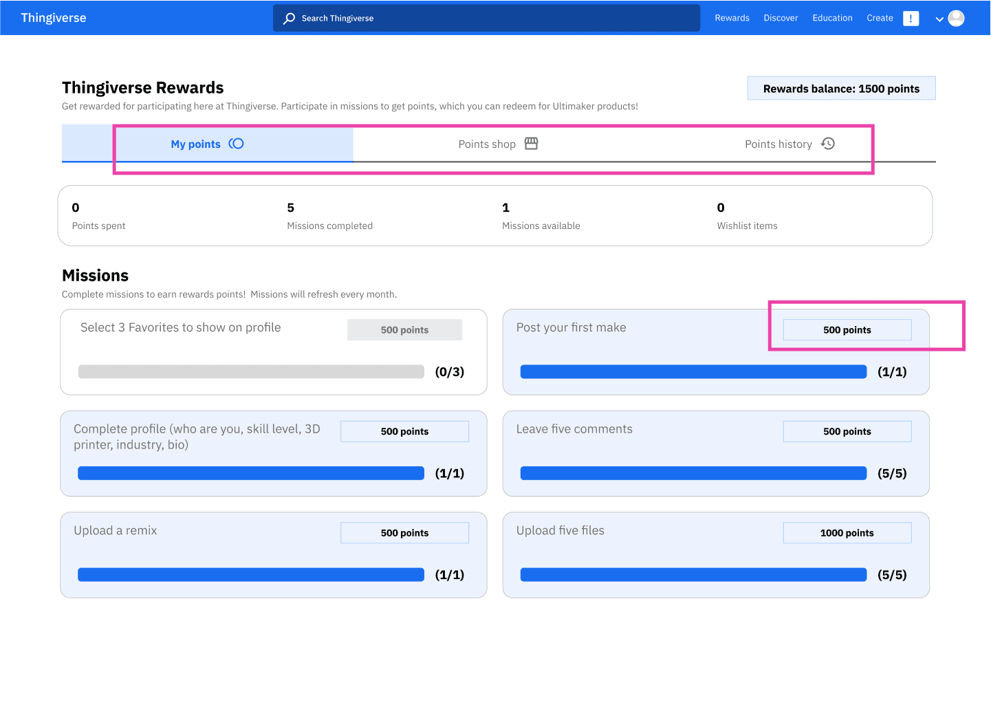
I brainstormed how to add the new features of the rewards shop and rewards points tracker.
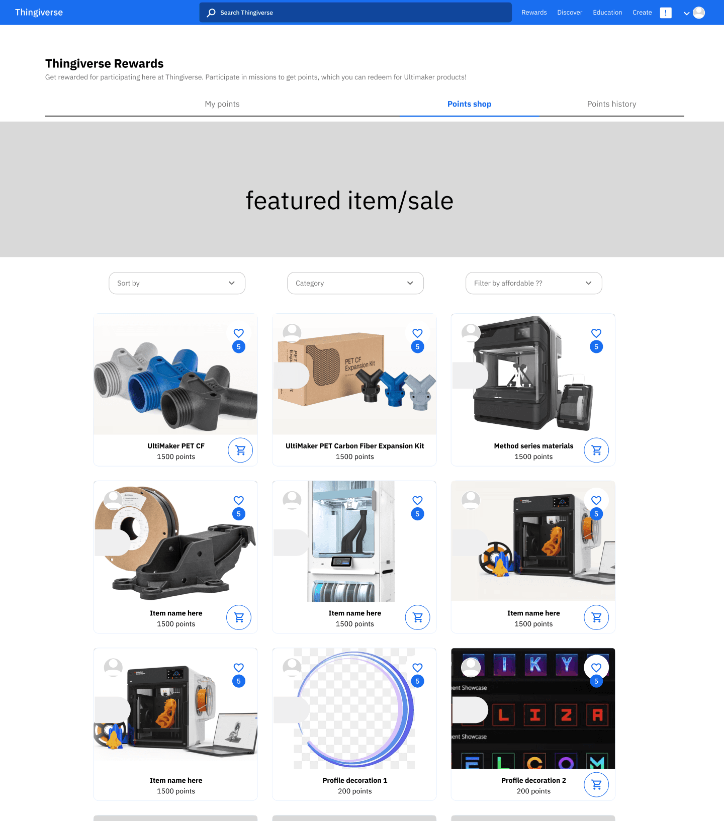
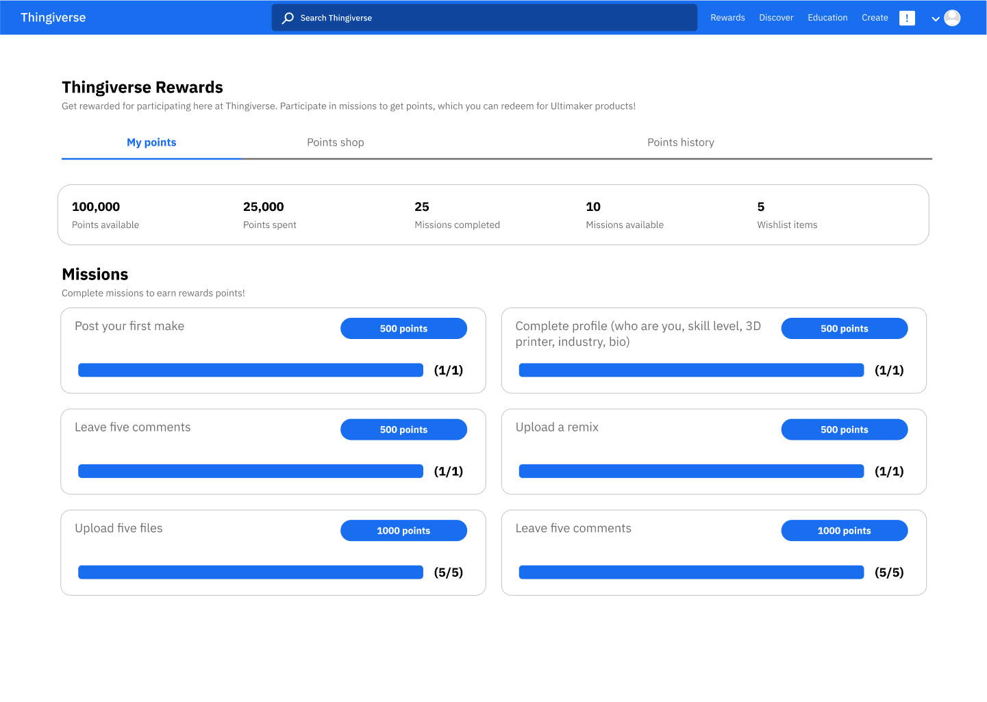
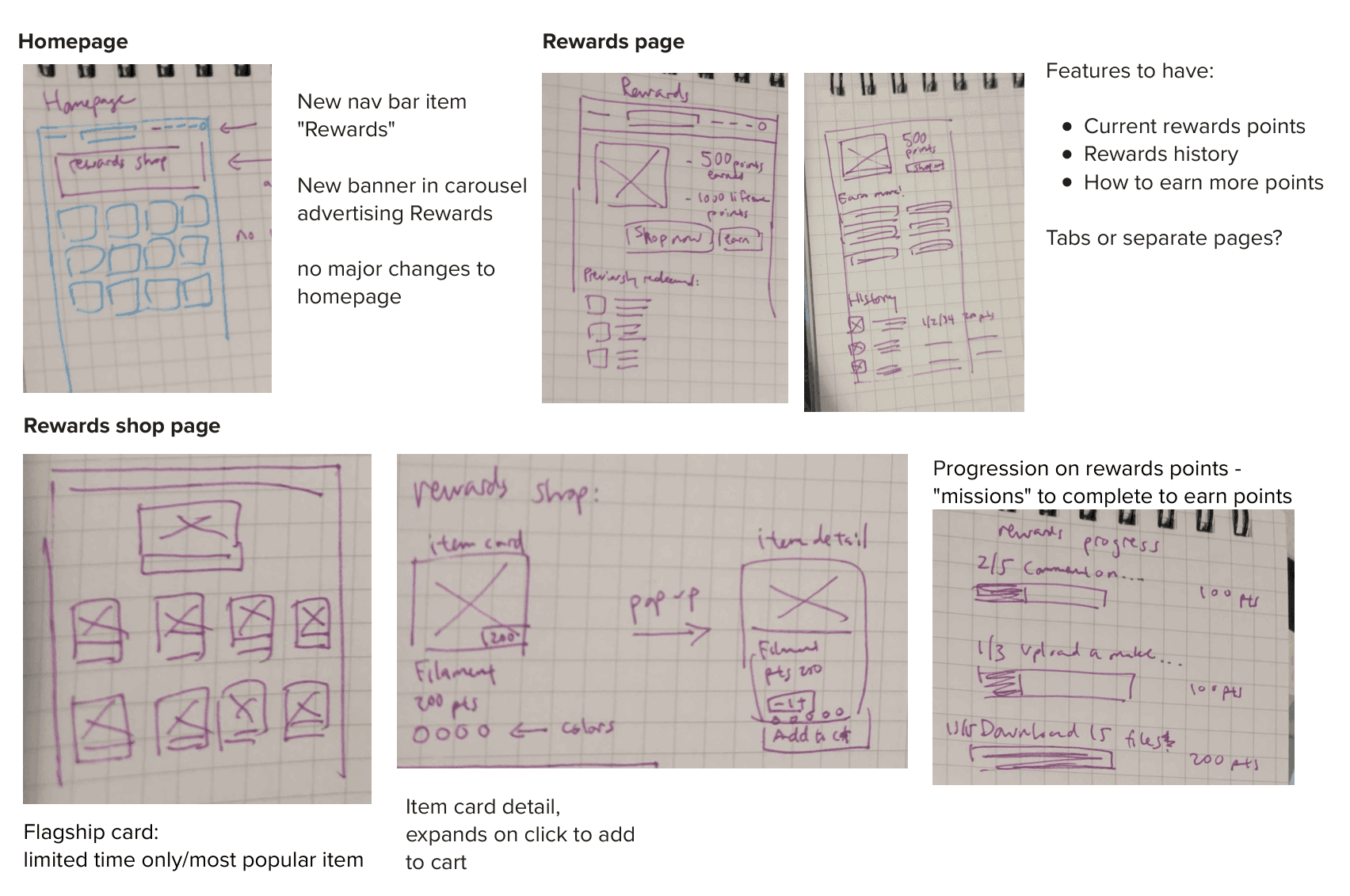
From there, I used Thingiverse's design and branding in order to build the new features that would blend seamlessly into the existing site design.

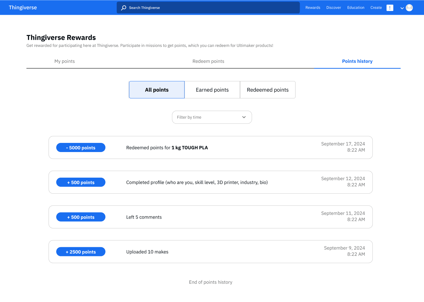
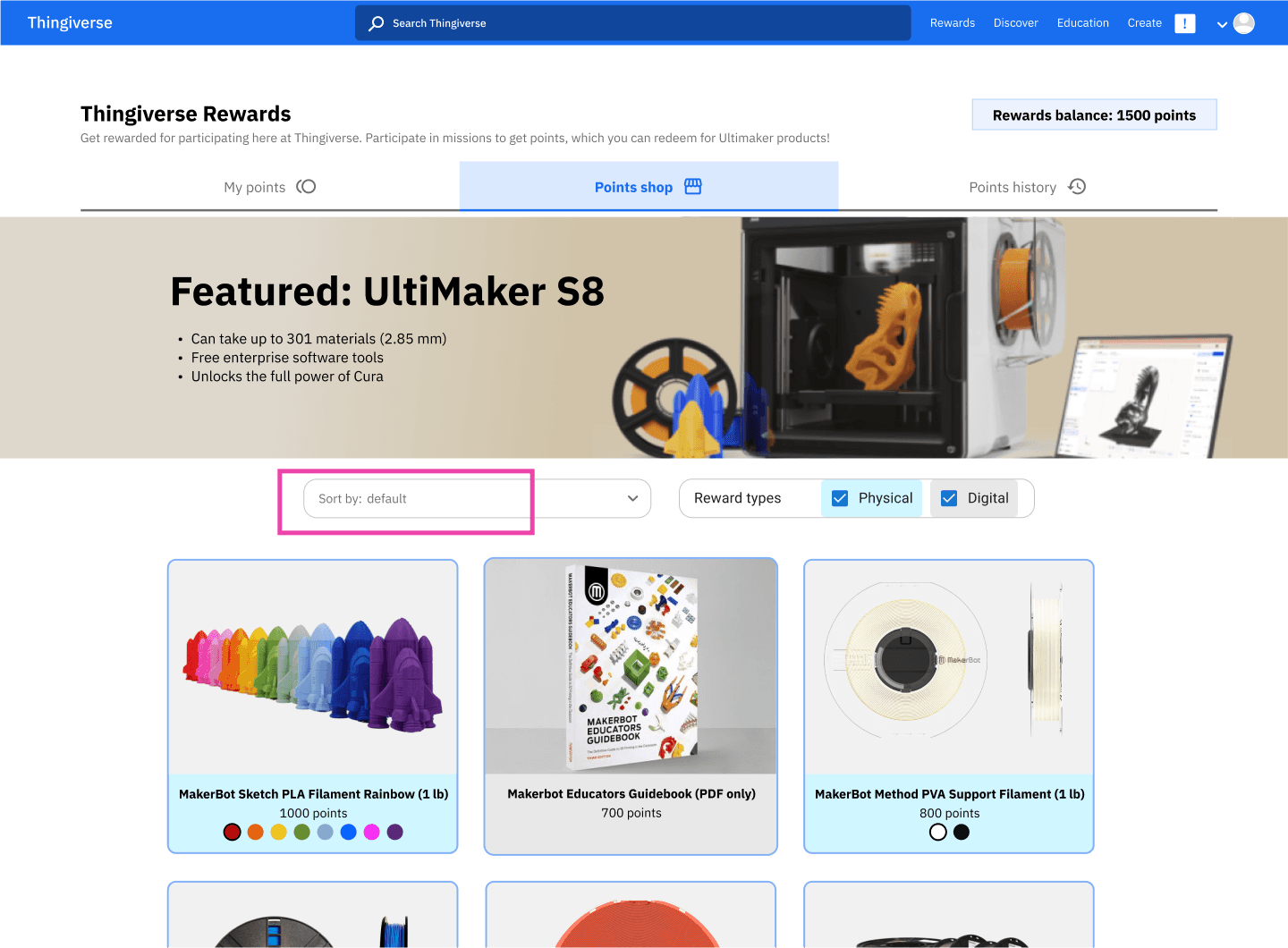
The rewards shop, missions and history page that I created.
Test: validating the ideas
User testing insights
The 12 users had a 100% success rate in completing the tasks (finish a mission, buy a shop item)
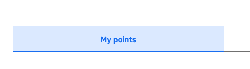
Users noted they had difficulty telling that the tabs (My points, rewards shop, points history) were tabs and not a progress bar
Five users noted they could not easily tell how many points they had accumulated.
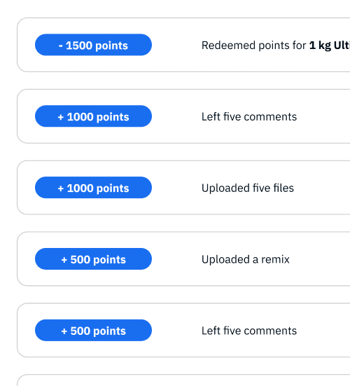
For the points history page, 5 out of 12 users noted they had difficulty telling apart gaining or spending points.
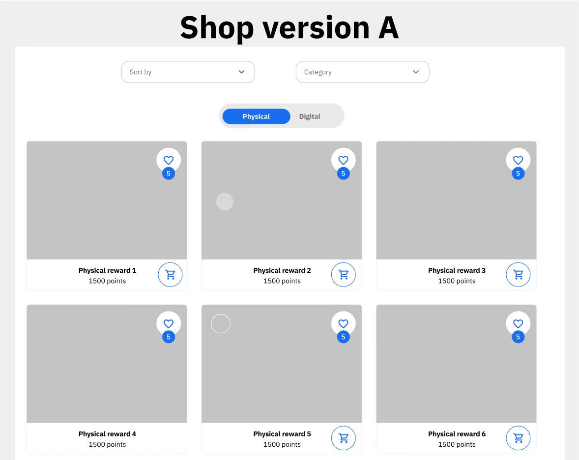
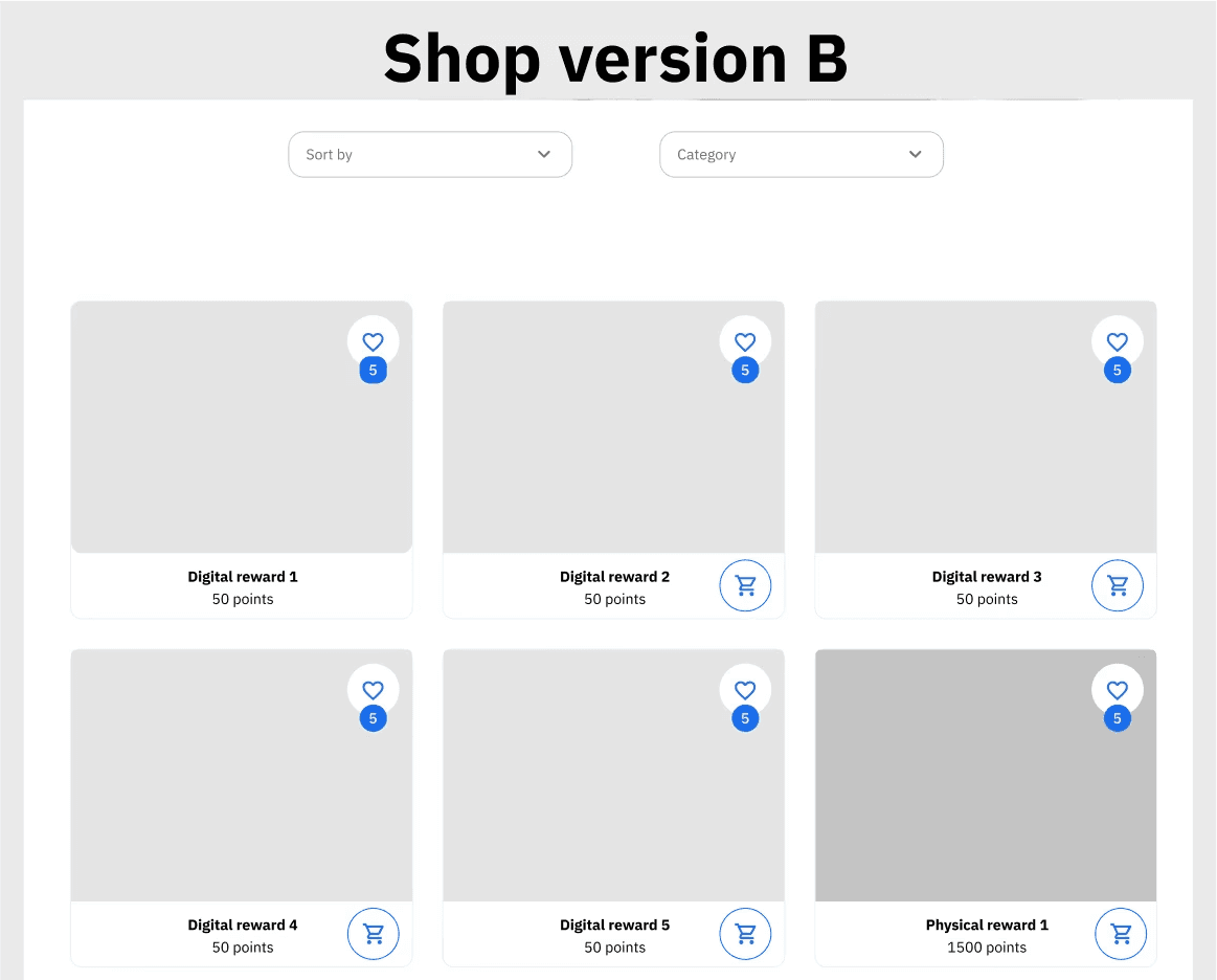
Users were also asked their preference between these two shop versions - one with a filter for digital and physical items and one without.
Users were fairly split, with 7 preferring A and 5 preferring B.
With this feedback in mind, I made changes as I increased the fidelity of the wireframes.
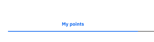
Before
After
I increased the visual clarity by highlighting the selected tab.
Before
After
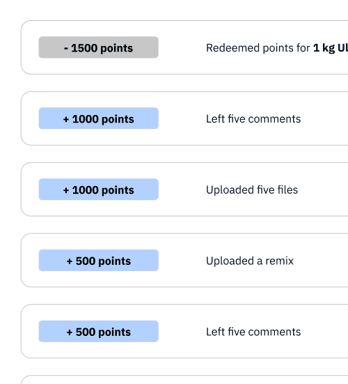
I lessened the affordance of the points history points. I also color coded the addition and subtraction of points for easier readability.
With the more polished prototype, I did a round of usability testing with 20 users.
Usability test results
Users had a 100% success rate for the task of completing a mission
Users had a 84.6% success rate for the second task, partially because of administrative error in directing users to the right target.
100% of users explained correctly what the purpose of the filters are.
Implement
Conclusion and next steps
Users were able to successfully complete the tasks relating to the new feature. The gamification of socializing means that users could be motivated by rewards in order to promote behavior that is beneficial both for other users and for Thingiverse.
In the future, I would like to implement further integrations with the site (for example, personalizing recommendations and missions), and implement more ways to incentivize favorable user behavior.
Impact
Users were successfully able to navigate the rewards shop, with 100% success rate
Users could explain the different features of the rewards shop.
Users felt the experience of the new feature was seamlessly integrated into the existing site.
What I learned:
Doing research can yield unexpected findings - I did not expect that users would be so against socialization features
E-commerce information hierarchy is very complex, and users already have expectations of how a storefront should behave
Look to existing pattern libraries and how competitors implement goals
Making sure that new components fit within an existing design system - if users can tell the difference, something is wrong