Case Study
Contribiia
developing a collaborative money-saving app
Role
UX design lead, brand designer, design librarian
Tools
Figma, FigJam, Google Drive, Microsoft Office suite, Otter.ai
Duration
7 weeks
Goal
Working with a client in a team of three junior UX designers to create a collaborative money-saving app based on rotational savings clubs
Results
Bringing stakeholder's initial idea into reality with increased value proposition
Created logo, branding and style of Contribiia
Directed UX team to create a cohesive and coordinated app
Background
The stakeholder brought his startup app idea to the three UX designers. He had already done market research, and knew he wanted to bring the idea of rotational savings clubs to Canada.
Discover: What do we need to find out before we start designing?
The team followed the double diamond process for the development of Contribiia.

Interviewee demographics:
Users with previous knowledge about savings clubs
Users that are unfamiliar with savings clubs
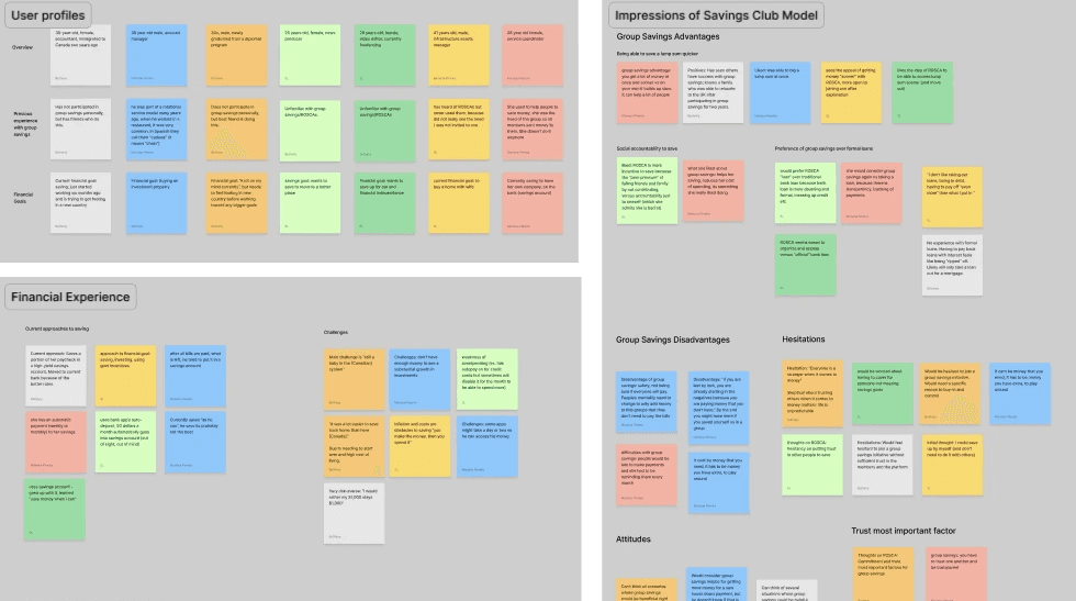
Insights from:
users unfamiliar with savings clubs
Lack of knowledge of how a savings club works, wariness of this new (to them) concept
Unsure of advantages of savings club over bank or traditional savings methods
Skeptical of trusting others in savings journey
Insights from:
users that have participated in savings clubs
Familiarity with concept makes them more open to trying a digital version
Concern: How is this better than the traditional (offline) method?
Former club organizer can see appeal of using app instead of manually contacting group
Potential benefits of a collaborative savings app
Avoiding the more formal procedures of getting a bank or payday loan
Saving/raising money more quickly than if saving alone
Social accountability of involving friends/family in saving
Forming better financial habits by having set savings plan
Potential concerns
Unsure of trusting unknown app with financial information
Unsure of trusting others to pay in on time
What potential hidden downsides could there be

Weaknesses in competitors
Limited geographic reach, with few operating in Canada (Contribiia's target audience)
App mismanagement of funds, high costs in fees
Potential for fraud from other users
Strengths in competitors
Targets specific demographics that are already familiar with clubs (immigrants to the UK, refugees, religions)
Easier access to loans for underserved communities
Modernizing a familiar cultural institution through an app


Mapping out the customer journey map for our two different user personas showed us: where their experiences and pain points would differwhat opportunities there were for Contribiia to capitalize on
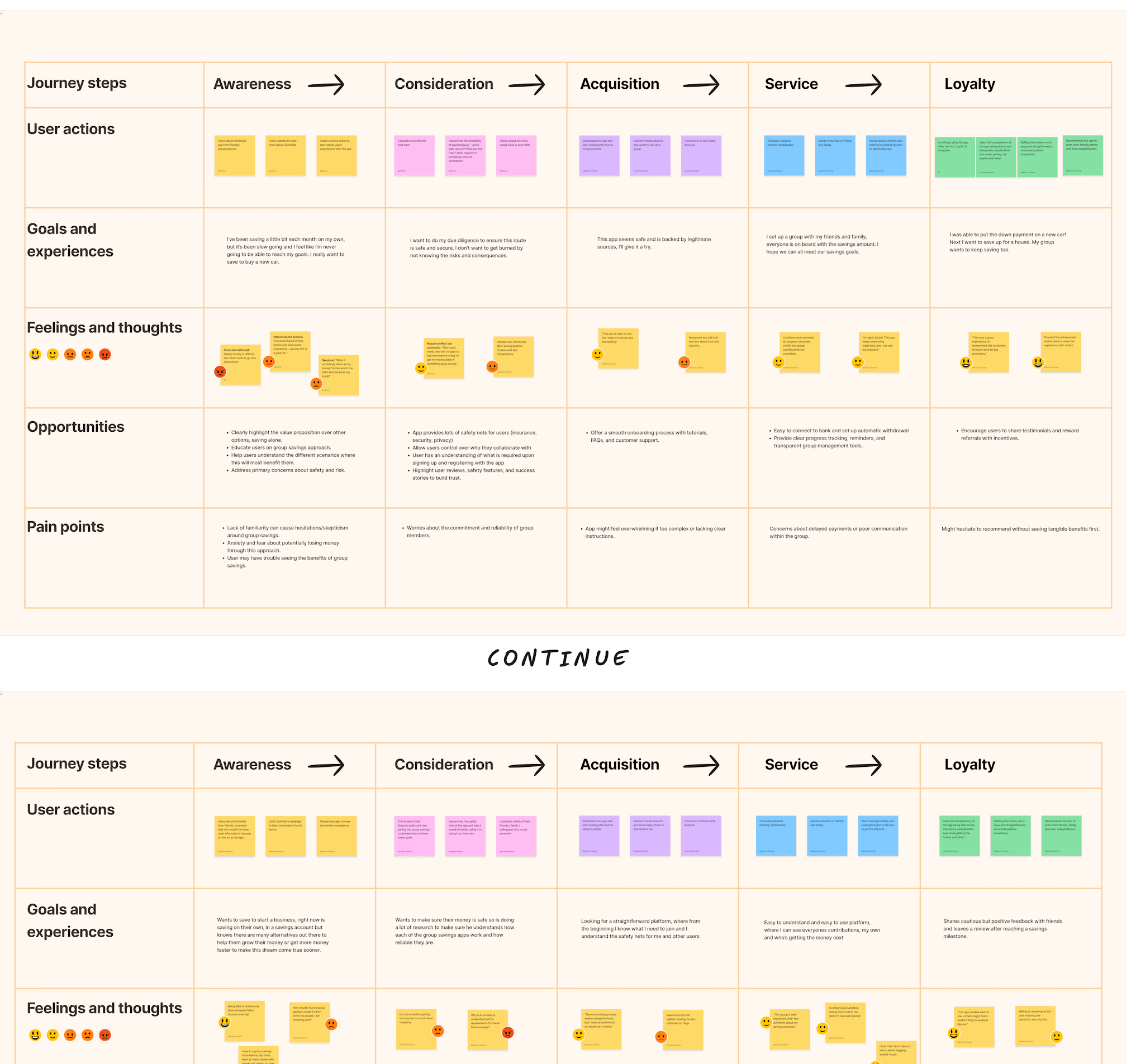
In our various research methods, we saw the potential for how we could address user concerns about trust and safety, while providing a way for them to save and better their financial standing.
Next, the team moved on to figuring out what we would build.
Define: What do we need for a functional app?
With our findings in hand, we could properly set our goals.
Problem statement
Many people face barriers in building savings, whether from personal problems such as motivation and lack of knowledge on saving strategies, or institutional barriers such as a low credit score or lack of credit history. This affects their current and future financial stability as well as ability to make large purchases and investments.


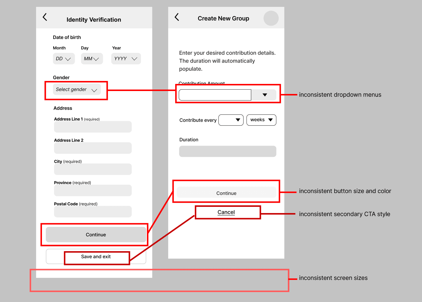
After our initial wireflows were created, we tested them with users.
User testing insights
Clarity of terms
We had not finalized our terminology at this point, so many users were confused about "contribution cycles," "public groups" and "payouts."
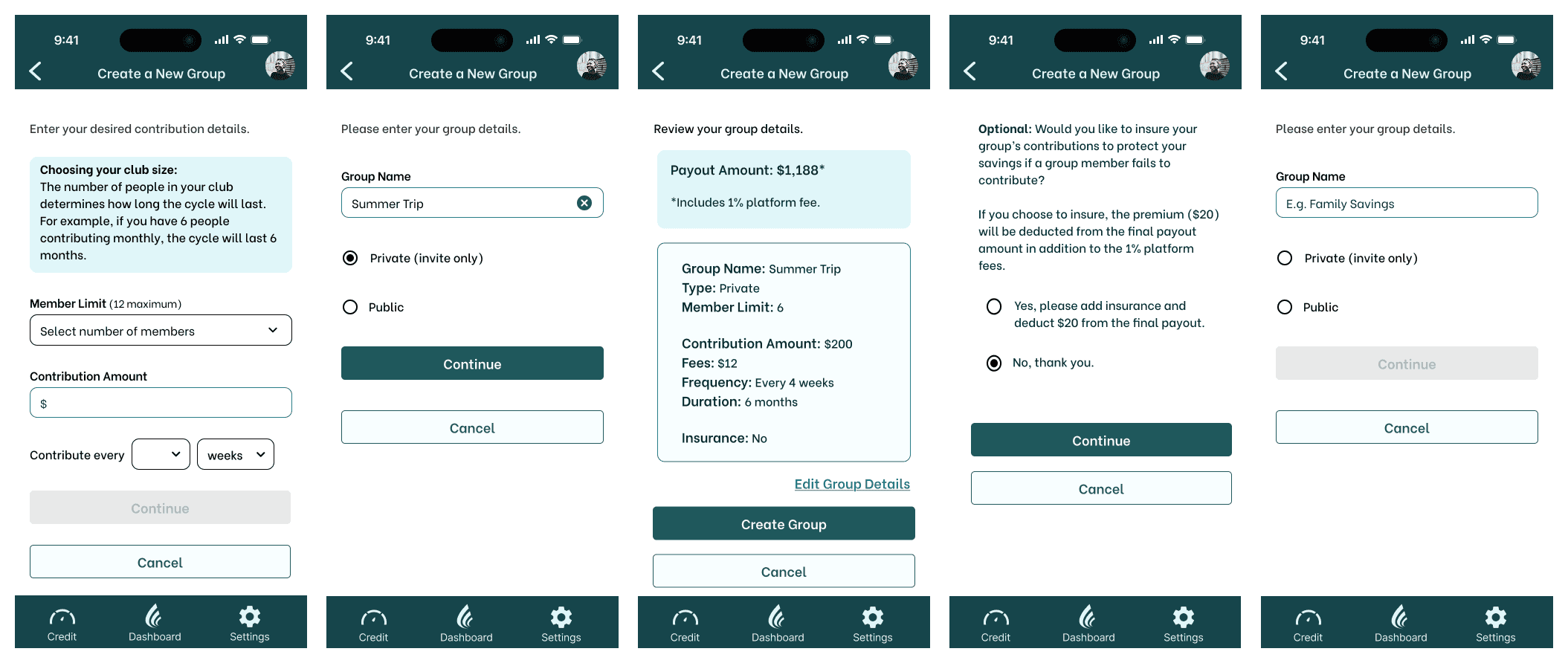
Public groups
When users found out they had the option to join groups with strangers, there was an almost unanimous sentiment of extreme discomfort. Users also wanted more control and clarity around the group settings, such as fees, contributions, and progress.
Security concerns
Several users voiced concerns about the safety of uploading personal documents and linking bank accounts. Clearer explanations about data encryption, privacy, and the security measures needed to alleviate concerns.
Value of this app over others
The biggest concern was the failure to communicate the value proposition of the app. Several users questioned why they would want to use this over traditional savings methods or a non-app version of a savings club, which we did not have a real answer to.
I realized the client's vision for the app was flawed.
The value proposition over a regular savings account was in question.
There was no user selling point for Contribiia.
Users unfamiliar with savings clubs were already hesitant about the concept.
Users did not have enough reason to trust this app, and other people, with their money.
Updated value proposition: Not only can the user save money collaboratively, but they can work on building and monitoring their credit, which will help their financial future in securing loans or mortgages.
With a stronger value proposition, we could proceed with a clearer vision of what the app would be.
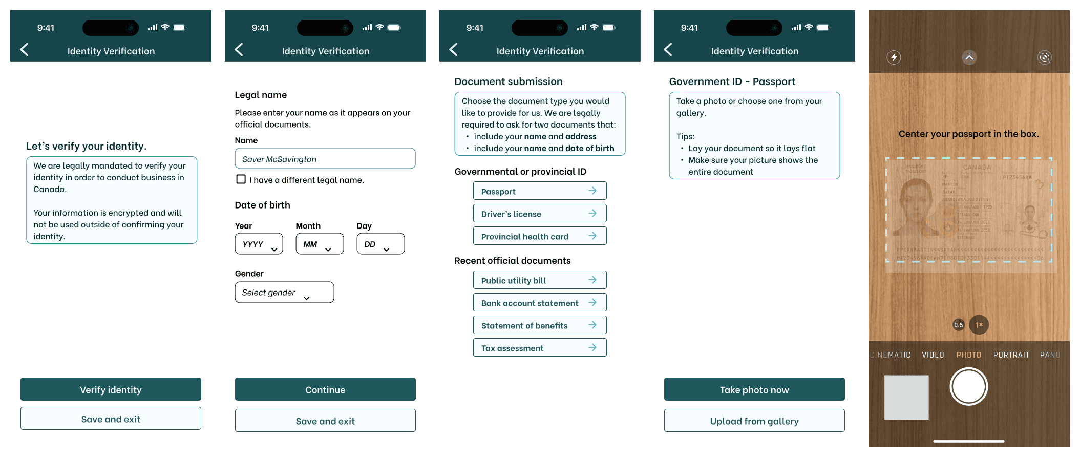
The UX designer team added new wireflows for the credit building and monitoring features.

App branding and style
As we iterated, we also turned our attention to how Contribiia should feel. The team ideated with a several starting concepts, and refined them based on the client's feedback.

Logo design
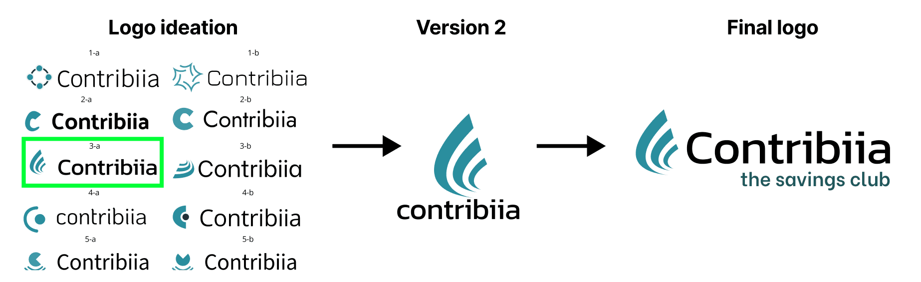
Style tile

With the branding of Contribiia decided, the team could bring together the user testing feedback to move up to high-fidelity wireframes.

With this library of components at the ready, we were able to create the high-fidelity wireframes much more easily.

Develop: How can we deliver the minimum viable product?
With the high-fidelity wireframes completed, and time running short, we moved on to testing their usability.
Users were given the prototype and asked to complete a series of tasks.
98% task success rate
6 users were asked to complete 8 tasks
Tasks included onboarding, creating and joining a club, and trying the credit score feature
Areas for improvement
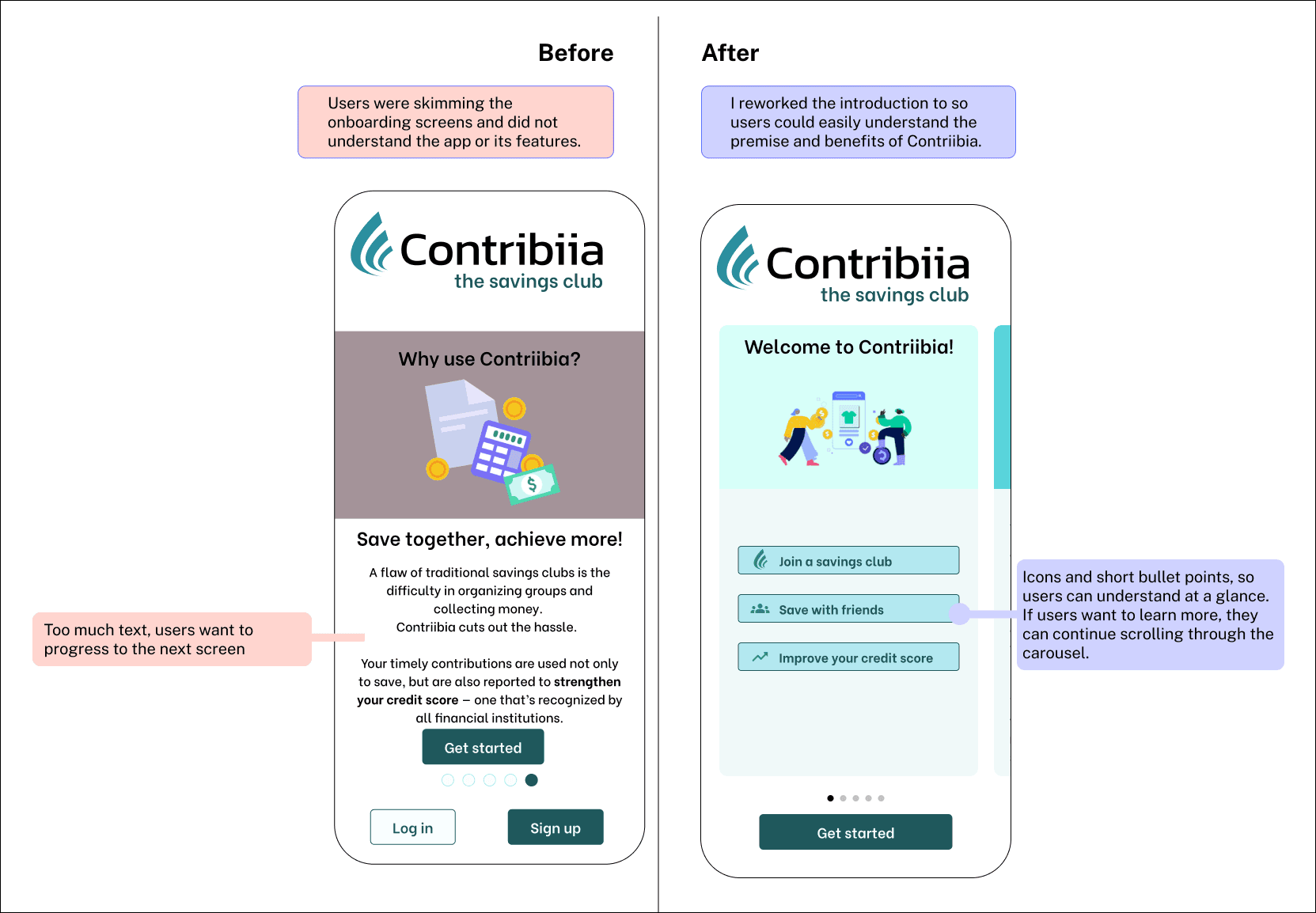
During onboarding, users were still unsure about concept of app
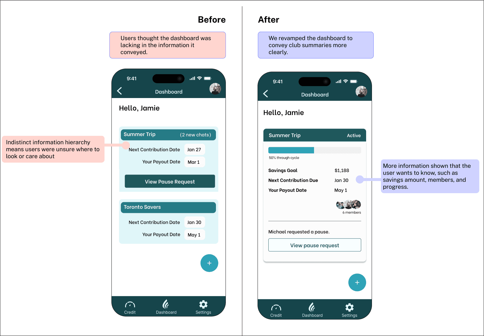
Users found dashboard lacking in features and engagement
Users unanimously disliked "share payout" feature
Fee disclosure came too late and felt deceptive
Our deadline was coming up, so we chose which changes we should prioritize.
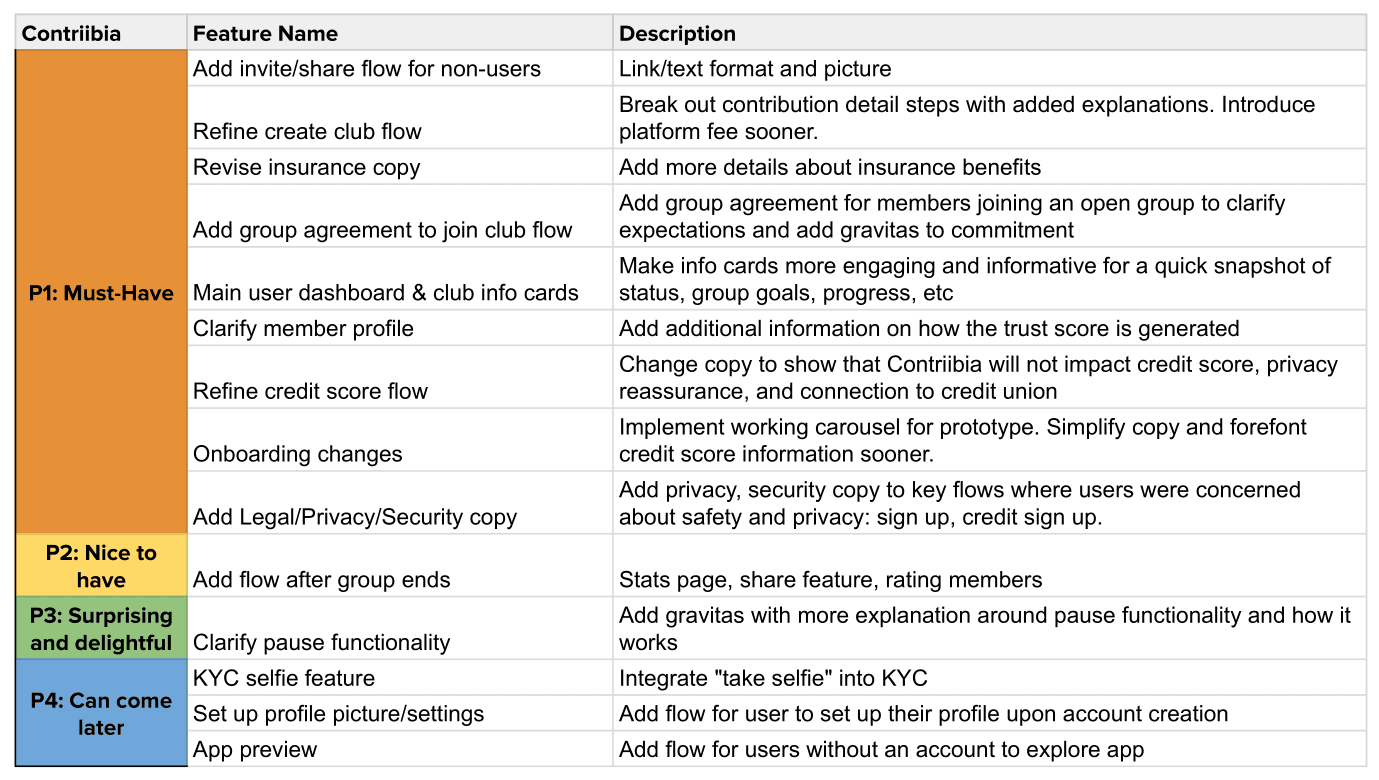
Working off our priority list, the team made the most pressing changes.


We made the changes and presented our final prototype to the client.

Deliver: What's next for Contribiia?
Conclusion and next steps
As the lead UX designer, I was able to bring the team together in making a cohesive product that addressed user needs and goals, especially when we had to reconsider the value proposition of the app.
User impressions
Users completed 96% of the tasks of joining and participating in a savings club
Users recognized the value proposition of collaboration to better their savings and credit-building habits
"It's cool that I can see credit insights and that this would help improve my credit score."
"I like the idea of saving money with friends and family, that we can hold each other accountable."
"I like that it's better than just saving money in the bank."
Next steps
Expand on user profile and other features to build user trust
Integrate affiliate links and partnerships that fit user needs
What I learned:
It is crucial to communicate the value proposition to the user ASAP
Set expectations and standards for your team in order to prevent headache later
Asking the difficult questions to the stakeholder leads to a stronger product