Case Study
The Shredded Carrot
a responsive website for a modernizing bakery
Role
UX/UI designer, UX researcher, brand designer
Tools
Figma, Maze, Adobe Illustrator, Wix, Square
Duration
65 hours
Goal
Working with a bakery owner client to attract a new customer base by refining the bakery's online presence and refreshing the bakery's branding
Results
Created responsive website according to stakeholder's budget and time constraints
Created new logo and branding for the bakery
Refined online presence of bakery, which previously did not have a functional website
Background
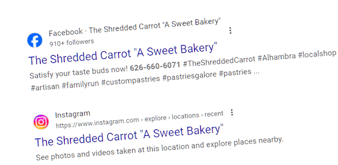
The Shredded Carrot Bakery (TSC) has recently changed ownership. The previous owner had built a strong rapport with the community and for those in the know, the bakery has a strong reputation as the place to go for carrot cake.
However, the bakery has trouble getting new customers, especially of a younger demographic.
The new owner wants to update and refresh the bakery’s image and online presence to attract more customers, while staying true to the original cozy and welcoming atmosphere.
To determine how to best help TSC, I followed the Double Diamond.

Discover: What is the bakery's current situation?

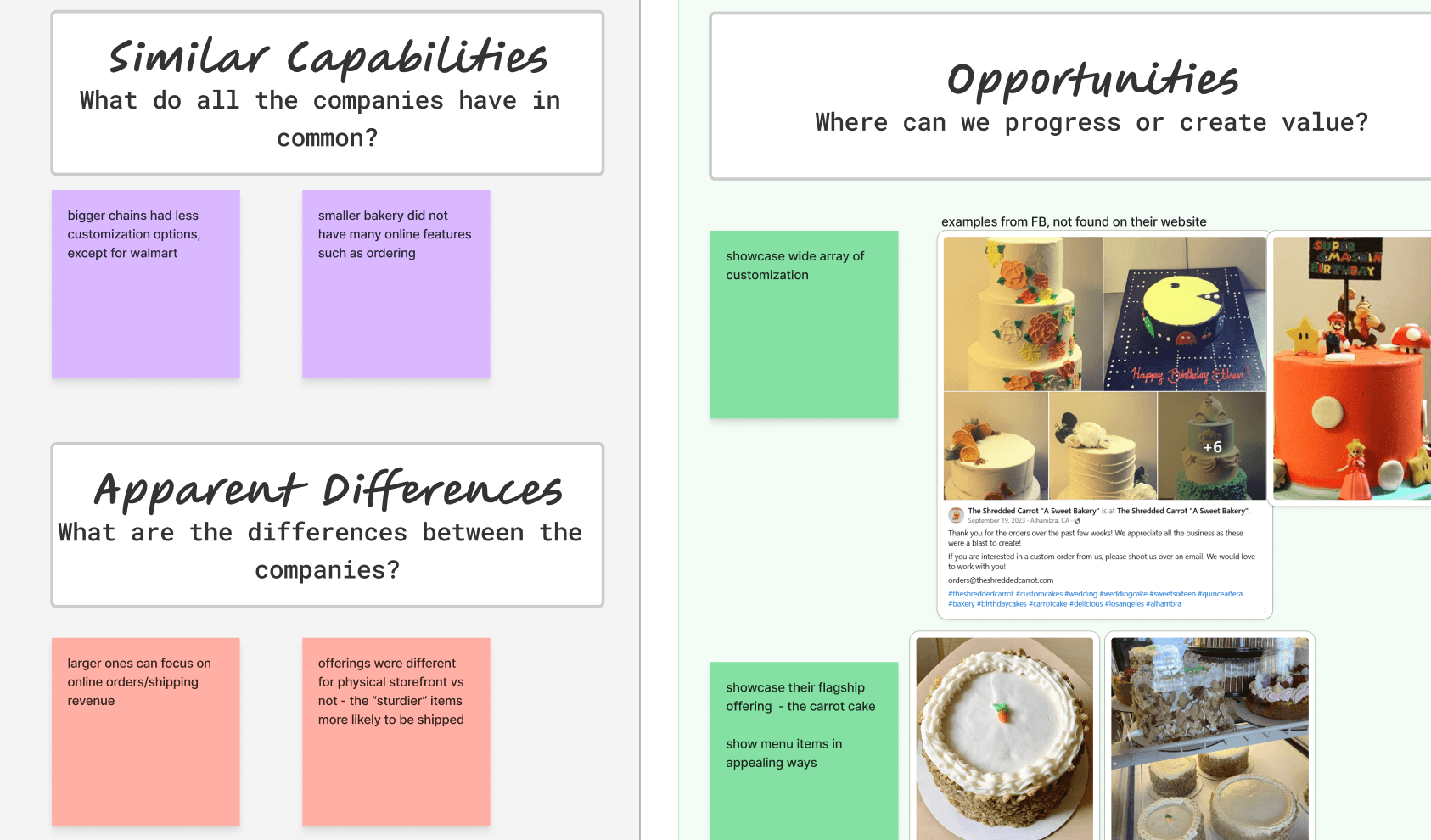
Opportunities to improve TSC's value proposition
Showcase TSC's wide array of customization
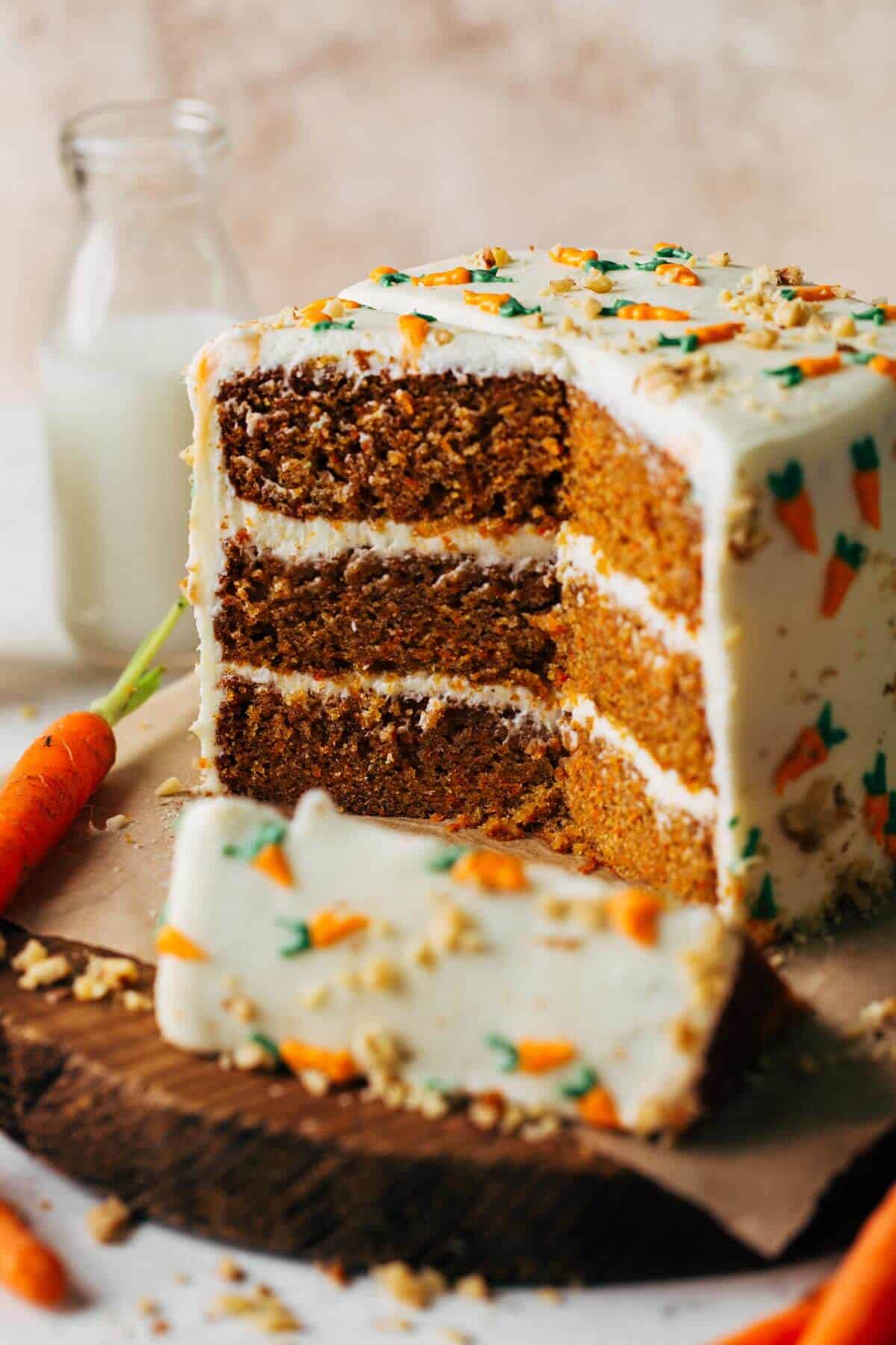
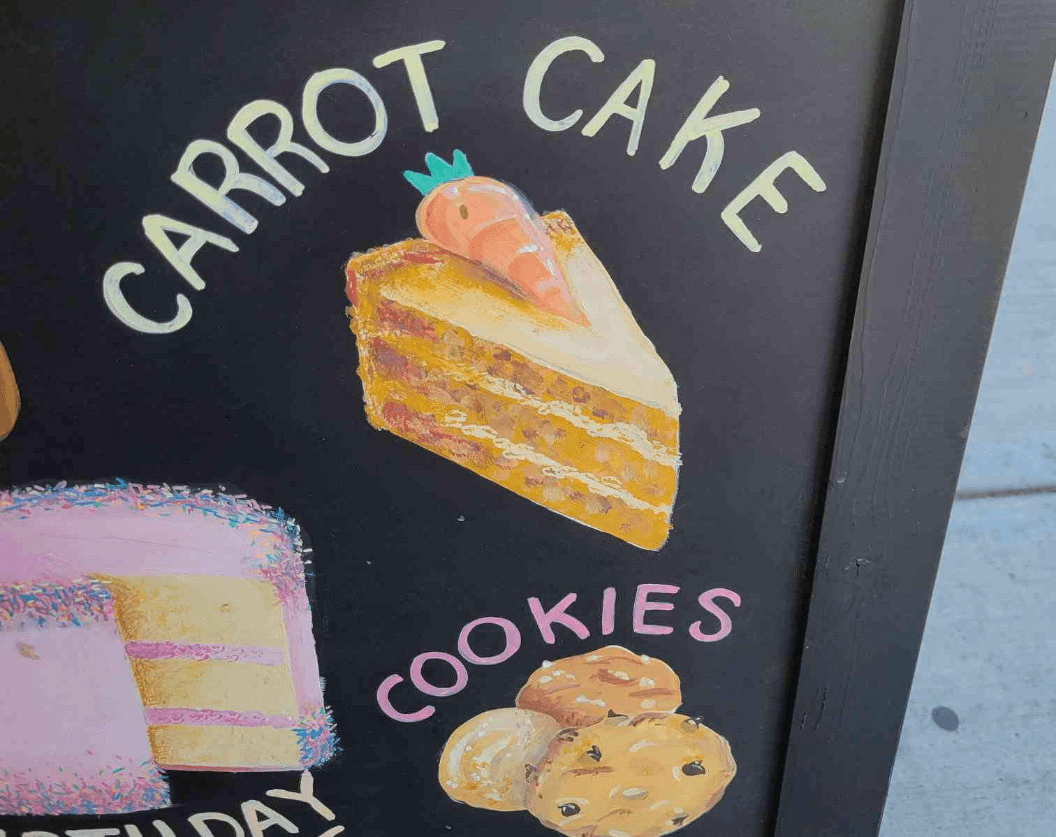
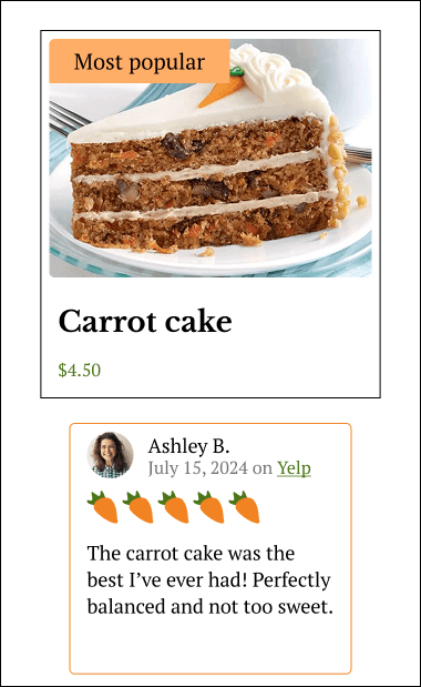
Showcase TSC's flagship offering - the carrot cake
Emphasize community and closeness aspect of the bakery
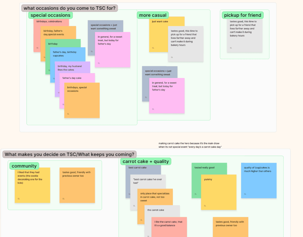
Insights from existing TSC customers:
The carrot cake is the main appeal of the bakery, TSC has a very strong foothold as the carrot cake bakery
Many customers found TSC through word-of-mouth recommendation from family and friends
Many did not even know that TSC offers custom orders or other non-carrot cake items, showing lack of knowledge about its menu
Insights from people that enjoy going to bakeries:
Users use factors such as Internet searches, recommendations, and proximity to find bakeries
Many use pictures or videos to judge whether a bakery is worth visiting, social media such as Tiktok and Instagram mentioned frequently
Bakery has a bigger draw if they have a specialty item to stand out (durian goods, chocolate croissant, etc)


With plenty of research conducted, I could identify how I wanted to tackle the problem.
Define: What can I solve?
After synthesizing the research insights, I arrived at some key questions for the business to consider:
How might we familiarize both current and new users with all of TSC’s offerings?
How might we make it easier for new users to discover TSC?
How might we eliminate the confusion with errors in placing a custom order?
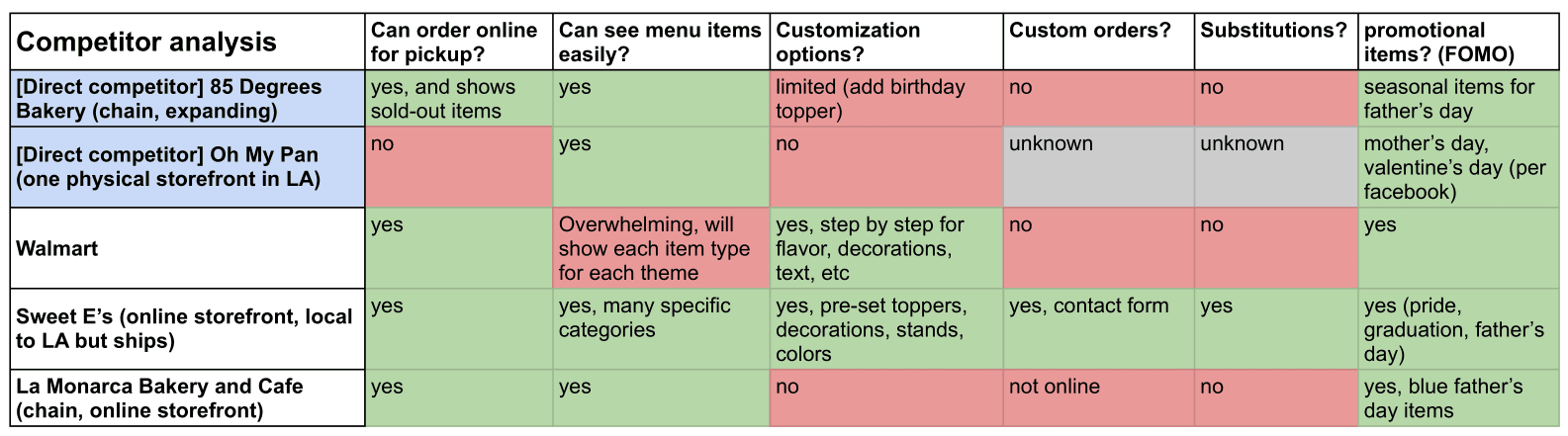
There were also technical limitations to keep in mind:
Budget is limited for hiring web developer/website fees. Some features may need to be cut, or we can rely more on pre-made templates from website builders.
Integration of bakery's current point-of-sale system (Square) would be ideal, for inventory and analytics purposes.
The bakery does not have access to the previous ownership’s accounts or social media, meaning they will have to start their online presence from scratch.
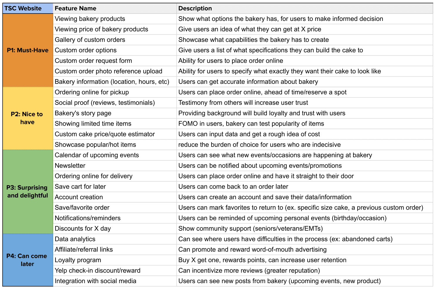
With the features of the website decided, I worked through the tasks a user might undertake while navigating, and developed a sitemap.


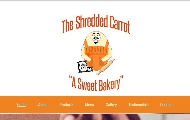
Design: Putting the site together
The stakeholder decided that using existing Wix templates would be the most budget-friendly way to get a website up and running. With that in mind, I sketched out the desktop versions of the pages.

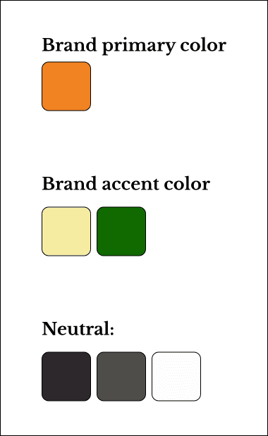
Logo and brand design
At the same time that I was working on the website structure and and wireframes, I was also ideating with the stakeholder about the bakery's branding.


The new owner liked the homey, cozy, community-focused atmosphere that the previous owner created in the physical space of the bakery, and wanted to recreate that virtually.
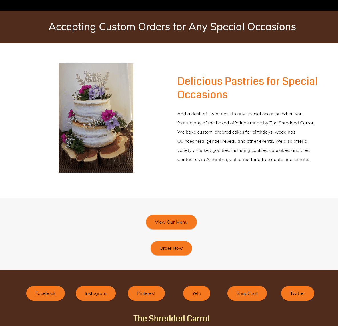


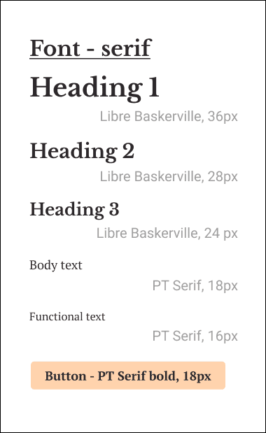


I applied the new branding style to the wireframes to get a working prototype.

Deliver: a fresh new website for a new bakery
Testing and conclusion
From there, I tested the usability with the users. As this was based on an existing Wix template, I did not have to make too many changes. However, some users were confused about the "Gallery" versus "Menu" versus "Order now"
The stakeholder wanted to emphasize that:
there were items that would always be in stock at the bakery
the bakery could make items per customer request
but that users should not expect to order some obscure flavor and be able to pick it up in ten minutes.
I emphasized the separation between ready-made items and made-to-order items.
With the users validating that the site design made sense, I created the high-fidelity prototype with the updated images and item pricing.
Then I recruited more users for one more usability test.
Usability test results
Users no longer experienced confusion between the “menu” and the “order online” functions.
Users no longer had difficulty in identifying the different pages.
I asked users about the “fresh from the oven” section - which is meant to be a section highlighting items that are only sporadically in stock. Users understood that these items were not available to order online.
I cleaned up the prototype further and had the final product ready to hand off to the web designer.
Conclusion
Working within the budgetary constraints was a challenge; both the bakery owner and I had many ideas for a bespoke, hyper-custom website and ways to increase user engagement. However, we had to keep in mind what was feasible at the lowest cost.
Impact
Users were successfully able to navigate purchasing bakery items.
Users could easily determine what the bakery offered.
Users could detail a custom order request without any confusion.
Users were able to find information about the bakery (hours, location, contact information) with no problem.
"I like that I can see what I'm getting - "eat with your eyes" and all that"
***get more impressions
What I learned:
It is crucial to communicate the value proposition to the user ASAP
Set expectations and standards for your team in order to prevent headache later
Asking the difficult questions to the stakeholder leads to a stronger product